This article refers to releases and features. Depending on your workspace type, you may see "schedules" and “activities" in your workspace.
Aha! Roadmaps | Introduction to analytics
Data informs your strategic decisions. Assessing goals and initiatives, reviewing customer feedback, or presenting updates to leadership? Having all the data you need at your fingertips helps you make informed decisions and answer questions with confidence.
But raw data is just a start. Many product managers spend hours each week compiling data from several tools, only to stitch together a report that may not capture the latest. Clumsy reporting tools lead to poor visualizations that hinder creativity, hide insights, and reduce confidence in product decisions.
In Aha! Roadmaps, you can report on hundreds of data objects. Start with one of over 75 popular example reports built by product experts and customize it to fit your needs. You can also build your own report from scratch. Every report updates in real time as data changes across your account. Thanks to over 30 integrations and robust custom field mapping, every data point will be accounted for in your Aha! Roadmaps account.
In this article we will talk about report creation in Aha! Roadmaps and walk through each individual report type.
Click any of the following links to skip ahead:
How to think about building reports in Aha! Roadmaps
Before you create reports, it can be helpful to think about how the Aha! Roadmaps reporting model works. Let's build a few reports together to help explain the model.
Reports are built around the relationships between record types
When you create a report, you select a primary record type — features, for example — and then either add fields from your primary record type or add another related record type, such as initiatives.
This example report — features, with their initiatives — will show you a list of all features and the initiatives they link to, including features that are not linked to any initiatives. But it will not show you the converse; it will not show you any initiatives that have no features linked to them. To see that, you would need to build your report around initiatives first, then features.
Not all record types relate to each other directly
For this step, let's imagine that you want to report on features, requirements, and initiatives.
You could build a report based on features with their initiatives because features link to initiatives. But you could not build a report based on requirements with their initiatives, because requirements can't link to initiatives directly.
The way to solve this problem is to think about what record types relate to each other. Features link to requirements directly, and features link to initiatives directly. So you can build a report based on requirements, their features, and the features' initiatives.
A report based on requirements, features, and initiatives will show you a list of all requirements, their parent features, and the initiatives those features link to.
The order of record types matters
For this step, let's compare two reports. One report will be built on features with their initiatives. The second report will be built on features, their releases, and the releases' initiatives.
In the first report, you will see a list of all features, and all the initiatives they link to (including any that are not linked to an initiative).
In the second report, you will see a list of all features, all the releases they are a part of, and all the releases' initiatives.
Releases and features might be linked to different initiatives, so these two reports would display different initiatives. Both reports are useful, but because of the order of the record types, they will show you different information.
You should feel free to experiment with reports in Aha! Roadmaps. Pairing different record types together will highlight different aspects of your data, and that is a good thing! We made the Aha! Roadmaps' reporting model powerful and flexible for just this reason.
Create a report
There are two ways to create a report. If you start on your reports overview, by navigating to Roadmaps Overview, you can pick an example report. Aha! Roadmaps comes with over 75 example reports to choose from. Pick one that fits your needs and modify it as you see fit.
Otherwise, any time you create a report in Aha! Roadmaps you will use the Create report interactive modal. From here, you can use an example report, or follow the steps to create your own custom report.
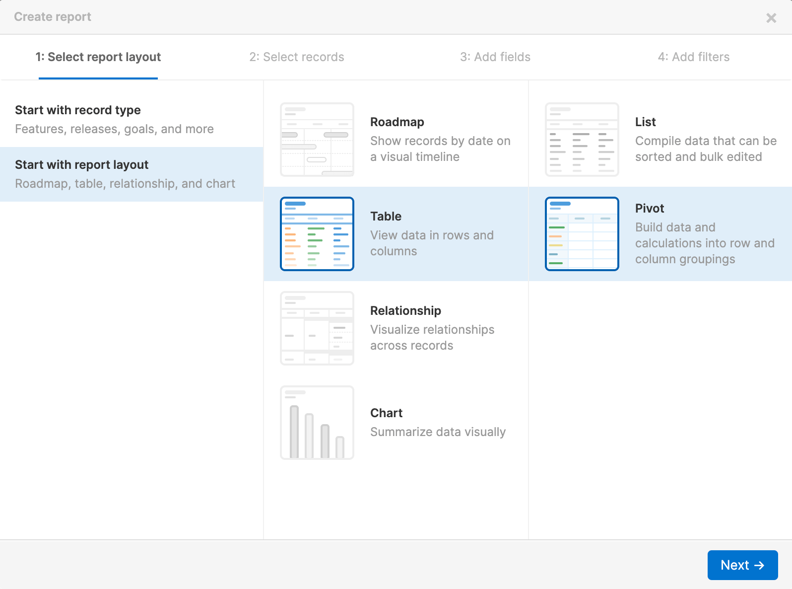
If you choose to Create your own report, choose the record type you want to build your report around. You can choose from Popular record types, Advanced (less commonly used) record types, or, if you are an Enterprise+ customer, Custom tables.
Once you select a primary record type, you can pair it with another secondary record type. For example, features and releases (or activities and schedules) are often analyzed together, so you can select Features with releases here to save yourself an extra step.
Note: If you don't see your preferred record type pairing here, don't worry. You can always link additional record types later in the Add fields step.
In the Add fields step, you can add fields related to the record type(s) you already selected, or add additional record types to your report. Remember, the order of the record types you select will change the data your report displays.
It can be helpful to add the phrase "with their" when considering record type relationships. So a report built on features and releases would be "features with their releases."
The last step in the report builder is to Add filters to your report. You can add Basic filters here for a simple series of dropdown filters at the top of your report. Or, you can add Advanced filters if you want the filters to have a relationship with each other, and make use of the logical operators All, Any, and None. If you know exactly how you want to focus your report, you can set your filter values right from the report builder. And later on, you can always use inline filters to refine your reports too.
Click Create report to create your report. Any time you need to come back to the report builder, you can. Click the Edit data or Edit filters icons to return to the relevant step.
Filter your report
After you have created your report, you can always adjust the filters to focus it further.

To create a basic filter, hover over the filters bar at the top of the page and click the Add filter icon. Select a record type, then one or more filters. Click Add to add them. This is a great option to add a filter quickly without opening another modal.
To create an advanced filter, click the Edit filters icon on the filters bar. This will take you back to the report builder, where you can apply logical operators between filters.
Once you have your filters set, you can lock them or set hierarchy filters to auto-update. And you can always remove a filter by clicking the Remove filter X icon beside it.
Create a dashboard
Dashboards consolidate reports, charts, and roadmaps into a single view. As you use reports to organize and analyze your data, think about how you might use a dashboard to communicate the insights they provide.
Click on any section of a chart dashboard panel to open a custom list report of its underlying data.
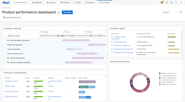
You can add almost any view you create to a single dashboard, organize and annotate the dashboard with text boxes, and then share your dashboard with your teammates. Anyone you share a dashboard with can filter it — without adjusting your original. This is useful when you want to use the same dashboard across multiple teams.
List reports
The Roadmaps List view is your go-to tool for creating custom list reports based on hundreds of different data objects. With the list table, you can add column headers for every Aha! Roadmaps' data object. Then you can filter and sort the data to present different views of what you have going on in your workspace or across your account. You can even bulk edit records and bulk send records to an integration with a list report.
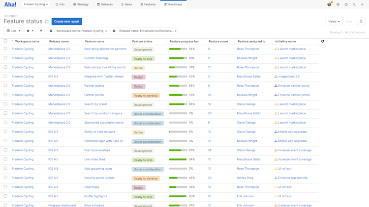
Read our create a list report article for full details on how to create your own.
Pivot reports
The Roadmaps Pivot view is an incredibly powerful tool for taking all of the data in Aha! Roadmaps and creating in-depth analysis reports on what is going on. Similar to the Roadmaps List view, the pivot view allows you to manipulate data from the hundreds of different data objects stored in Aha! Roadmaps and then organize it all in a customizable pivot table.
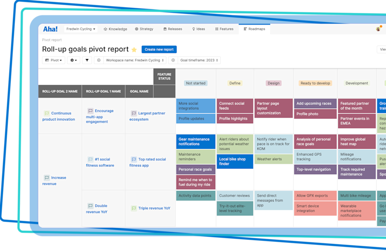
Read our create a pivot table article for full details on how to create your own.
Charts
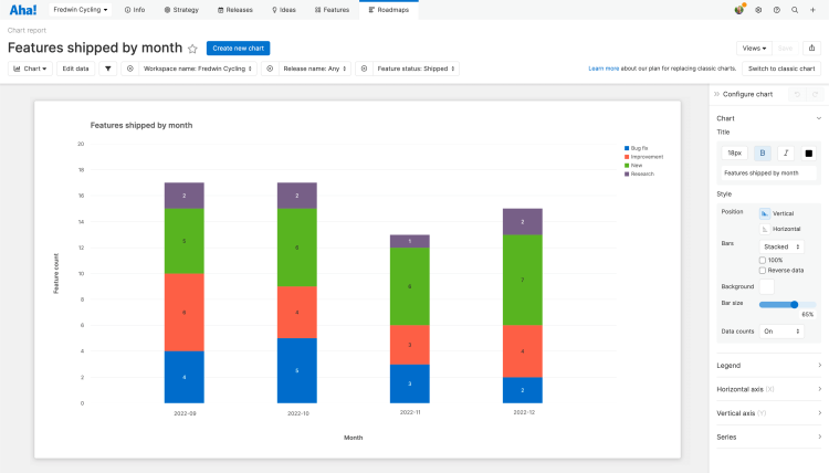
The Roadmaps Chart view is a beautiful way to visualize data. Use them to highlight the most important aspects of your reports for your stakeholders.
Click on any section of a chart to open a custom list report of its underlying data.
Read our create a chart article for full details on how to create your own.
Product value reports
The Roadmaps Value is an excellent way to summarize the value your team delivers at every stage of your product development journey so you can focus on delivering what customers truly care about. Use it to show the impact of your efforts, and inform conversations about the priorities your team is making.
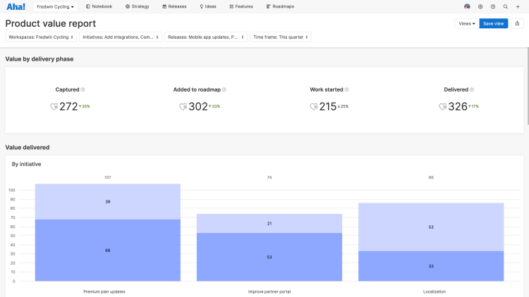
Read our product value report article for full details on how to create your own.
Capacity reports
The capacity report is hidden until at least one workspace in your Aha! Roadmaps account enables capacity planning for individuals or capacity planning for teams and then customizes their menu navigation to show the report.
The Roadmaps Capacity report is the perfect tool to help you visualize your team's capacity, by month, for the initiatives, epics, and features you need to complete to achieve your strategic goals.
Use the capacity report's Individuals setting to see who has the availability to take on more work, who is overburdened, and what scheduled features conflict with each other — and might not be completed on time. If you are an Enterprise+ customer, use the Teams setting to visualize your teams' workload using different planning scenarios, customized work schedules, and advanced estimates. Uncover capacity conflicts at the team level, and resolve them before they affect your teams' ability to complete work on time.
The capacity report also highlights work that is unscheduled or unassigned, so you can ensure that there are no unexpected gaps in your roadmap.

Read our capacity report article for full details on how to create your own.
Dependency reports
The dependency report is hidden by default for new Aha! Roadmaps accounts. If you would like to enable them, you can do so by customizing your menu navigation.
Under Roadmaps Dependency, you can visualize record relationships in a single, customizable view. This is separate from the dependency map, which shows dependencies for a single record, such as a feature. The dependency report allows you to view dependencies for multiple objects at once, such as all of the dependencies for every feature within an upcoming release.
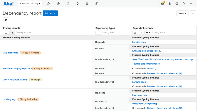
Read our create a dependency report article for full details on how to create your own.
Hierarchy reports
The hierarchy report is hidden by default for new Aha! Roadmaps accounts. If you would like to enable them, you can do so by customizing your menu navigation.
The Roadmaps Hierarchy view is the perfect way to compare the alignment of your workspace and parent line strategy with the actual work that is planned. The hierarchy report makes it easy to visualize relationships across your goals, initiatives, releases, and features and to identify where you have gaps in delivering on your strategy.
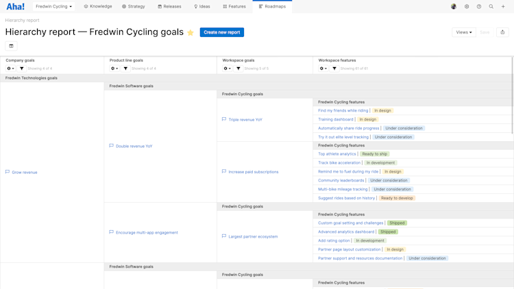
Read our create a hierarchy report article for full details on how to create your own.
Diagram reports
The diagram report is hidden by default for new Aha! Roadmaps accounts. If you would like to enable them, you can do so by customizing your menu navigation.
Under Roadmaps Diagram, you may visualize and share an unparalleled view of what you plan to develop and why.
Each layer of the chart represents a different set of data. Start with your workspaces at the core and work out to your releases at the edges. You can zoom in and out and even filter the screen by your workspaces, goals, initiatives, and releases to get the exact view that you want.
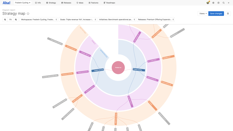
Read this article for more details on creating diagram reports.
Share your reports
You can easily share your reports with stakeholders by selecting one of the export options under the Share menu on the top-right of the screen.
To fold your reports into a presentation, select Add to presentation. In your presentation you can select the report's update frequency.
To add your roadmap to a dashboard, select Add to dashboard. Dashboards combine several Aha! Roadmaps views into one page to tell a complete story about your plans and progress.
To invite people outside of your Aha! Roadmaps account to view your reports, select Share as webpage.
To schedule recurring email delivery of your report, select Schedule email delivery.
To export your list report for further analysis, select Export to Excel or Export to CSV. You can import from CSV to update data later.
For a static version of your reports, export your report to PNG image or PDF document.
