How to use a wireframe in product management — templates included
Last updated: March 2024
As a product manager, how many new features do you define in a year, quarter, or even a month? As each new feature takes shape, you develop a clear idea of its usefulness and the value it will deliver to customers. But you also need to think about how it will work and how people will interact with it. A wireframe helps you quickly illustrate the feature's intended functionality — helping your design and engineering teams gain the clarity required to be successful.
Typically, product managers use wireframes to communicate with user experience (UX) or user interface (UI) designers during exploratory phases of product or feature definition. The UX team is responsible for the structural and aesthetic details of the product, but you set the tone by translating feature requirements into these initial visualizations.
Explore early-stage concepts and design wireframes in Aha! software — get started now.

In truth, anyone on the cross-functional product team can benefit from a visual that shows how a feature or component could display. These initial wireframes serve as a launch pad for illustrating concepts, gathering feedback, and gaining alignment — so that teams can design and build exactly what customers want.
Even if you are not expected to create your own wireframes, it is important to be involved and conversant in these visual guides. Understanding basic design concepts like this will help you speak the same language as your product design team, making for a more effective (and enjoyable) product build.
With this, let's dig into wireframing — feel free to skip ahead to any section:
What is a wireframe?
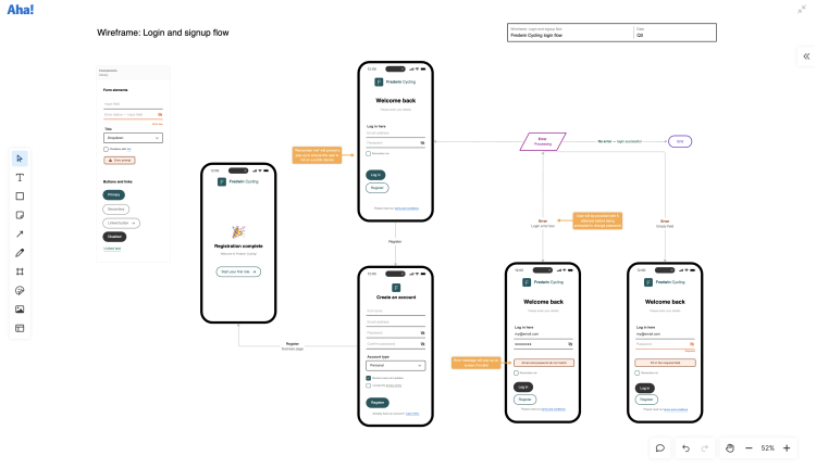
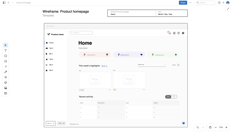
A wireframe is a rough sketch that conveys high-level functionality, page or site layout, and UX. It is typically used during ideation or brainstorming to show the potential direction of a page or feature for product, design, and engineering teams. For example, you could use a wireframe to show the layout of a product homepage. You might also map out a multistep flow, such as a signup experience for a mobile app or an online purchase path.
Wireframes are conceptual and low-fidelity. They are often rendered in black and white without logos or other design elements. This is because they are meant to convey product ideas and new experiences quickly and show what the different components of a page or feature should do without proposing specific design details (which will come later).
Modern product teams might choose to add color and style components to wireframes, however — especially when using dynamic tools such as a digital whiteboard. For instance, when using a digital whiteboard in Aha! Whiteboards, product managers can choose from more than 15 commonly used wireframe components. You can adjust to the screen you are designing for (desktop, mobile, tablet, or browser) and insert buttons, navigation menus, checkboxes, links, and input fields as you think through the new UX. Each component also has its own menu so you can customize its style, color, and font size.
No matter how you choose to sketch out these exploratory concepts, the goal of a wireframe is to provide a basic representation that the team can react to and discuss. Creating wireframes allows you to collect early internal feedback and gain alignment — making sure everyone agrees on the best path forward.
Wireframes vs. mockups vs. prototypes
Wireframes, mockups, and prototypes — is there a difference? Sure is. They might seem interchangeable, but each artifact serves a specific purpose within the design phase of product development.
Let's explore some definitions first. A wireframe, as we mentioned, is a simplified, low-fidelity blueprint of a UI outlining the layout and structure, but not detailed design elements. A mockup is a static, high-fidelity representation of a UI showing the visual design and aesthetic of a product or webpage. And a prototype is a functional model of a product or feature that helps users test and provide feedback on usability.
That is a lot. Let's break this down a bit in the table below:
Definition | Purpose | Elements | Creator | |
Wireframe | A sketch that shows what a product or feature will do at a high level | To collect early internal feedback and reach a consensus | The format and structure of content | PM or UX designer |
Mockup | A static visual of how a product or feature will work and how it will be used | To analyze visual elements and functionality in a more detailed way | Additional visual elements, such as logos and icons | UX designer |
Prototype | An interactive representation that demonstrates how users will interact with a product or feature | To gather user feedback through testing and actual experience | Final interactive elements and navigation | UX designer |
Wireframes serve as the foundation of the product design — everything else is built upon this initial illustration. Mockups take a wireframe to the next level by layering in design choices and more detailed information, depicting a more realistic rendering of how the new feature will be used. Prototypes include elements of interactivity. These are not actual code, but everything is built out enough for the core concepts to be validated.
Not every new feature in development will require a wireframe, mockup, and prototype. A simple wireframe or mockup is sometimes all that is needed to secure stakeholder buy-in and shift to development. The point of each of these design artifacts is to bring clarity to what customers are really after so teams can build products that customers love.
How are wireframes used with cross-functional teams?
As a product manager, you probably spend a large chunk of your time collaborating closely with company leaders as well as the cross-functional team. Executive stakeholders and teammates in engineering, UX, marketing, sales, and support are all focused on the same goal — delivering real customer value — so it is essential to seek out their feedback and get buy-in. This is especially true during early-stage product planning.
For nontechnical individuals in areas such as senior management, marketing, sales, customer support, and product operations, wireframes help drive collaboration forward in a few significant ways:
Clarify use: They make it easier for nontechnical stakeholders to understand proposed features and functionalities.
Solicit feedback: PMs use wireframes to secure input, and this feedback loop ensures the final product matches stakeholder expectations.
Reduce miscommunication: Visuals help individuals grasp complex functionalities, reducing the chances of misunderstandings due to technical jargon.
Wireframes also establish cross-functional alignment early. Say you are launching a new feature and want to give your marketing and support teams a head start on creating customer communications. Sharing wireframes with these teams will help them understand the customer journey and how the functionality works before the product launch. It can also help inform go-to-market activities and support documentation so your teams are ready to support customers.
On the technical side, wireframes can clearly explain page layouts and the experience you envision to product, UX, and engineering teams. Here are a few standout collaboration points:
Communicate technicalities: PMs use wireframes to promote early discussion between product and engineering on the project's technical requirements.
Align design: UX teams use wireframes as the foundation of the feature's functionality; mockups and prototypes are based on this work.
Identify challenges: Engineering teams use wireframes to identify any potential constraints early, allowing for adjustments before development begins.
Wireframes act as a shared reference point for product, UX, and engineering teams. This common understanding enables smoother handoffs between the design and development phases — meaning you get your new feature to market faster.
Wireframe tools for product managers
At a basic level, you can create a wireframe just by picking up paper and a pencil. Folks also leverage wireframing tools that provide a variety of ready-made elements for sketching a design quickly.
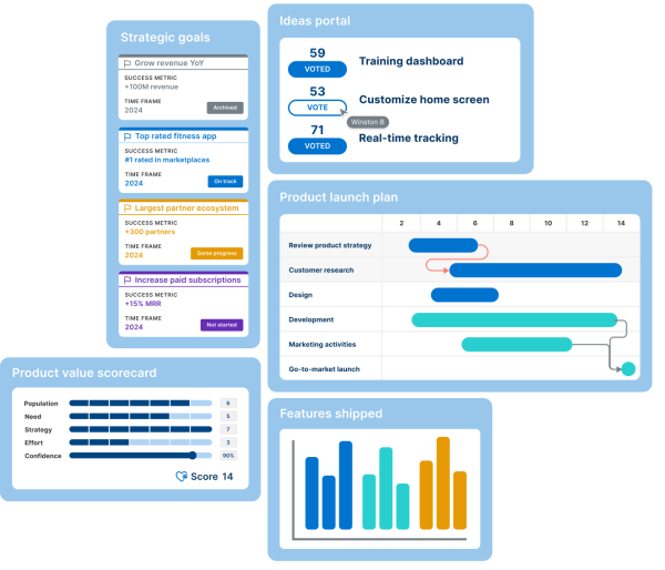
Many product teams use dedicated product management software such as Aha! Roadmaps, which includes strategy, roadmapping, and robust wireframing capabilities. If you do not require a roadmapping tool, opt for Aha! Whiteboards instead. With Aha! Whiteboards, you can quickly create wireframes from templates (including the ones below) and map out visual concepts. Teammates can jump in any time to share ideas and leave feedback. And when you are ready to define features and build out a more complete design, move over to Aha! Roadmaps with ease and start building out detailed product plans.
Although we are clearly excited about the new wireframing capabilities within Aha! Knowledge, keep in mind that there is no wrong way to go about it. Whichever method you choose, just make sure you can share your wireframes with others to gain alignment — so what you build serves customers well.
Wireframe templates for effective product building
Having wireframe functionality included in digital whiteboards can streamline your product planning. For inspiration, check out a few pre-built templates that support wireframe exploration below. (And find 100+ additional templates in our library.)
Analytics dashboard wireframe
Use this analytics dashboard wireframe template to align on your data dashboard's layout, functionality, and content. Use configurable components to develop a shared understanding of where data should be and how the user will interact with it. Then, share the whiteboard with relevant stakeholders to gather feedback — refining details as the wireframe evolves.

Product homepage wireframe
Use the product homepage wireframe template to get everyone aligned on the layout, features, and user flow of your product's homepage. Map out the vital elements of this important landing page, such as navigation menus, call-to-action buttons, testimonials, and more. Leverage the template to define your user flow and how your homepage will connect to sections throughout your website.

Signup wireframe
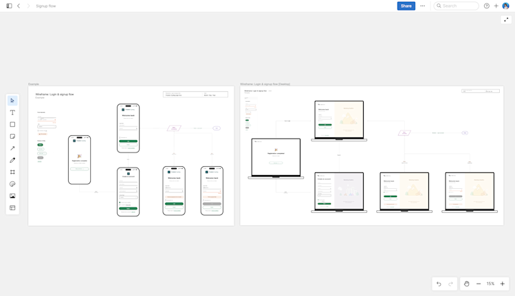
Get a jump start on mapping out a user's sequence of actions using this signup wireframe template. Illustrate the signup or login flow for your application to make sure the experience for your users will be a good one. Thinking through this flow in advance will reduce user frustration in the future and ensure a logical progression from one step to the next.

Use wireframes to communicate what customers really need, helping UX, engineering, and all cross-functional teams get clarity on what they are working on — and how they can add value.


