Just Launched! — New and Improved Aha! Navigation
We just launched the new Aha! Starter roadmap — the fastest way to build a visual roadmap. (If you have not checked it out yet, you should.) Whenever we deliver new functionality, we stop and think about how it fits into the overall product experience. What else will be affected? Is there an opportunity to make the product even better? Sometimes yes, sometimes no.
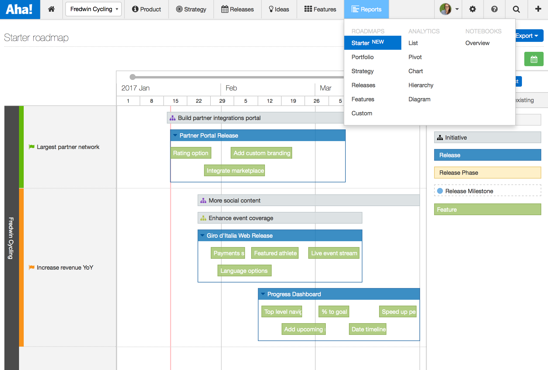
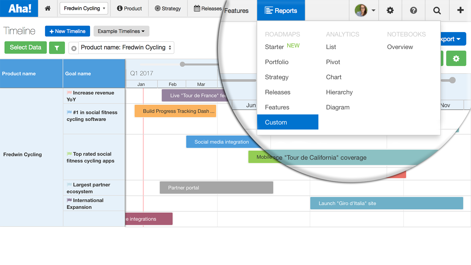
So in preparation for the Starter roadmap launch, we decided to take a closer look at the overall navigation. Why was it that we had different roadmaps everywhere? Well, it quickly became clear that we could provide you with a more intuitive experience by unifying the various roadmapping and analytics screens in Aha! under the hood of a single Reports tab.
In the new Reports tab, you can now find all of your Roadmaps, Analytics, and Aha! Notebook capabilities in one place. This makes it seamless to report on everything product management and securely share it with your teams.
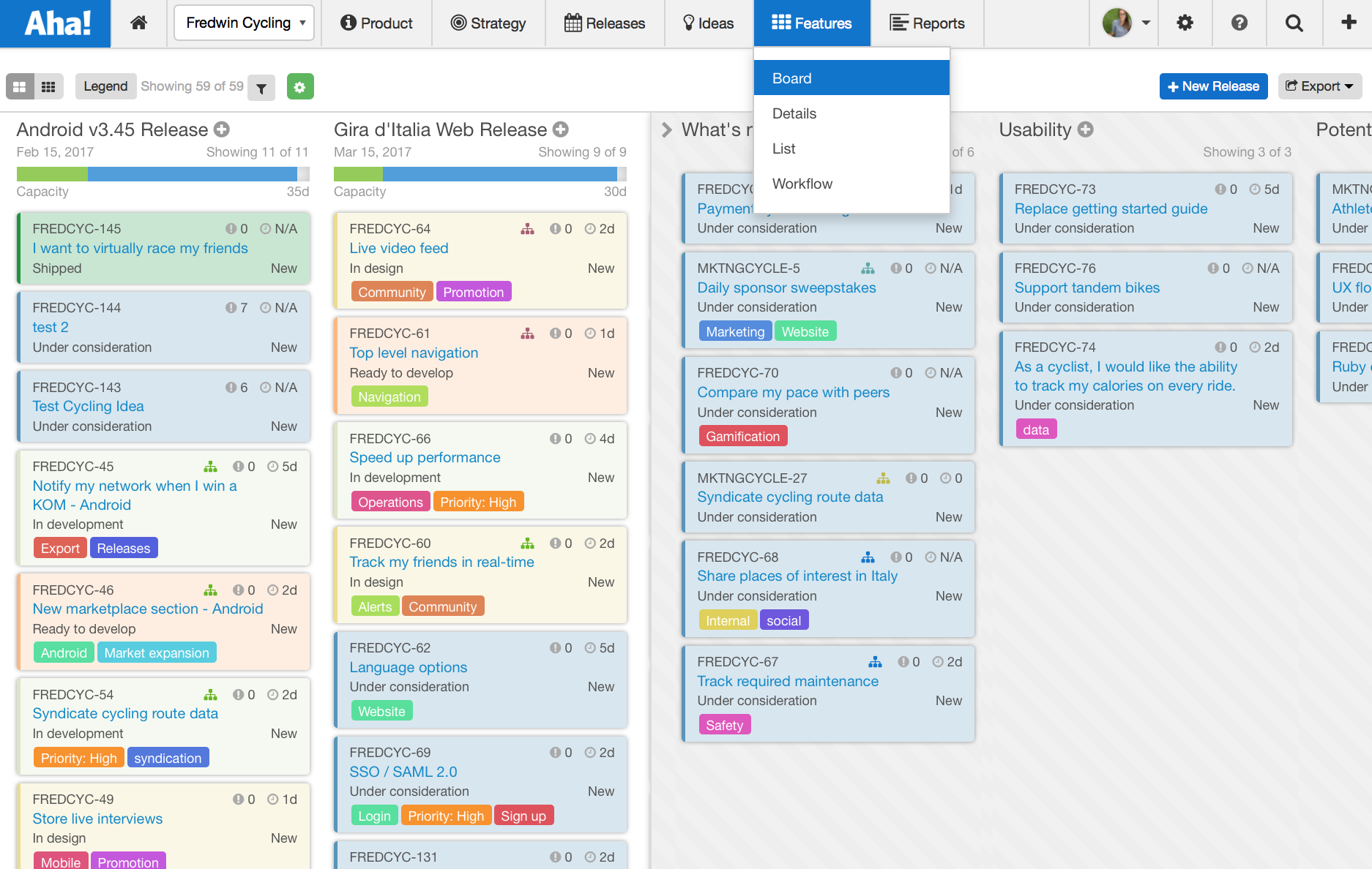
We also changed the style of the top-level navigation to provide you with quick access to every part of the application. Hover on a section and all sub-navigation is now displayed via a drop-down menu. This update has two benefits — it helps you get to what you need quicker and it helps us intelligently scale Aha! into the future.
Here’s a summary of the changes we made and why:
Unified Reports section Before, you had to move around the application to access your roadmaps, saved reports, and presentations. The new unified Reports tab gives you access to all Roadmaps, Analytics, and Notebooks in one place. You can now create stunning visualizations of your roadmaps and data — and share them — from this central hub.
Starter, Portfolio, Strategy, Releases, Features, and Custom (formerly Timeline) roadmaps are now found in the Reports section of Aha!
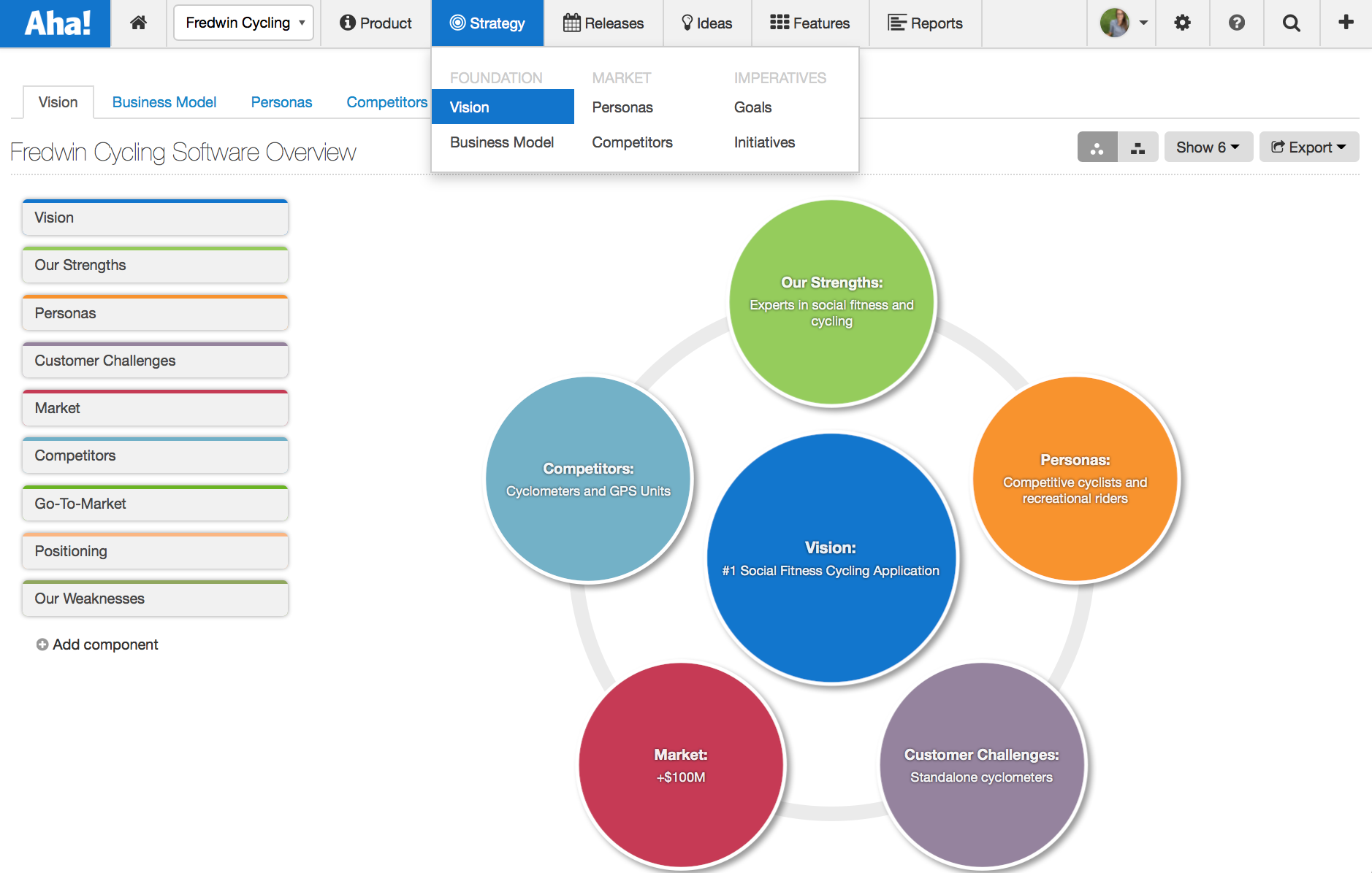
Updated Strategy section A strategic approach is fundamental to ensure you are building what matters. Now, Strategy is regrouped into three core sections. You have instant access to any part of your strategic plan.
Foundation: Vision and Business Model
Market: Competitors and Personas
Imperatives: Goals and Initiatives
Capture your product vision and explain the customer and market forces that will shape your product’s direction. Sitewide drop-down navigation We have moved from a multi-tier, horizontal model to a simple drop-down navigation. The new navigation activates on hover so that you can quickly get to the screen of your choice. Less time spent navigating means more time for getting work done.
The simplified navigation leaves more room for planning releases and creating beautiful roadmaps.
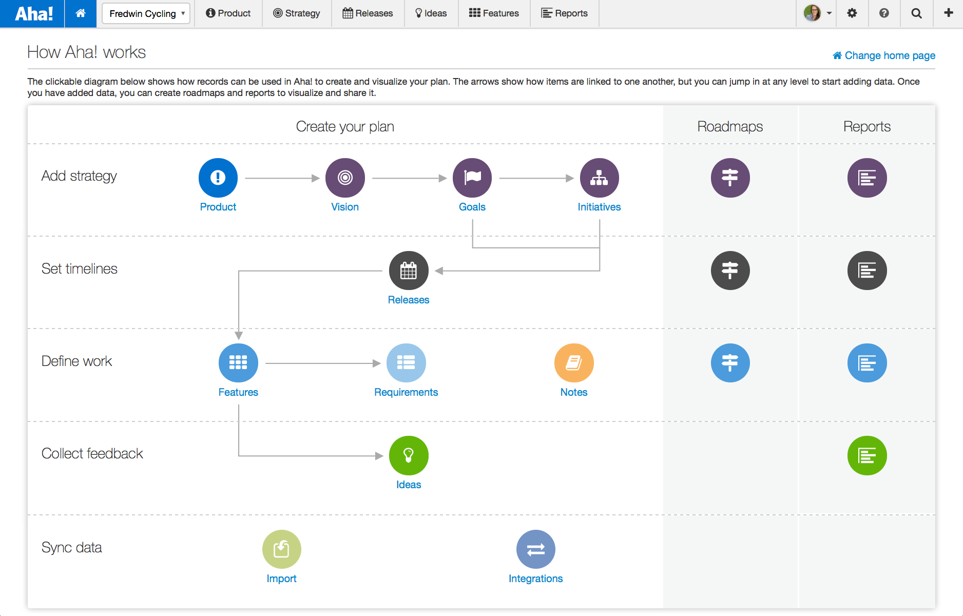
Easily access any part of Aha! We have changed what is presented on the home page for all users — unless you already set your own screen as the default. The default home page is called “How Aha! works” and it provides an interactive overview of the Aha! data model, as well as a quick way to access the most common parts of the application.
Each user can set their own home page by selecting the “Change home page” link on the screen or navigating to Settings Personal Home page.
The new navigation and grouping of information makes Aha! easier to use. But even better, it brings together all the powerful roadmapping, analytics, and presentation capabilities you love. So you can get busy planning your next big launch.
The new Starter roadmap is certainly a big addition as well. And we really wanted you to be able to find it. Hopefully, that will be no problem and these updates will help you get even more done. But if you get stuck along the way, our team of former product managers is always here to help.
Sign up for a free Aha! trial — be happy The new and improved navigation is available to all Aha! customers. If you are not already an Aha! customer, you may want to sign up for a free 30-day trial of Aha! now to see why over 50,000 users trust Aha! to set product strategy, create visual roadmaps, and prioritize releases and features.
