Features roadmap in Aha! Roadmaps
A Fresh Look for the Features Roadmap
"What is on the roadmap?" The answer to this question can look very different, depending on whether it is coming from executives, colleagues, or customers. Fortunately, the features roadmap lets you quickly customize product plans for different audiences. And today, the features roadmap experience is getting even better.
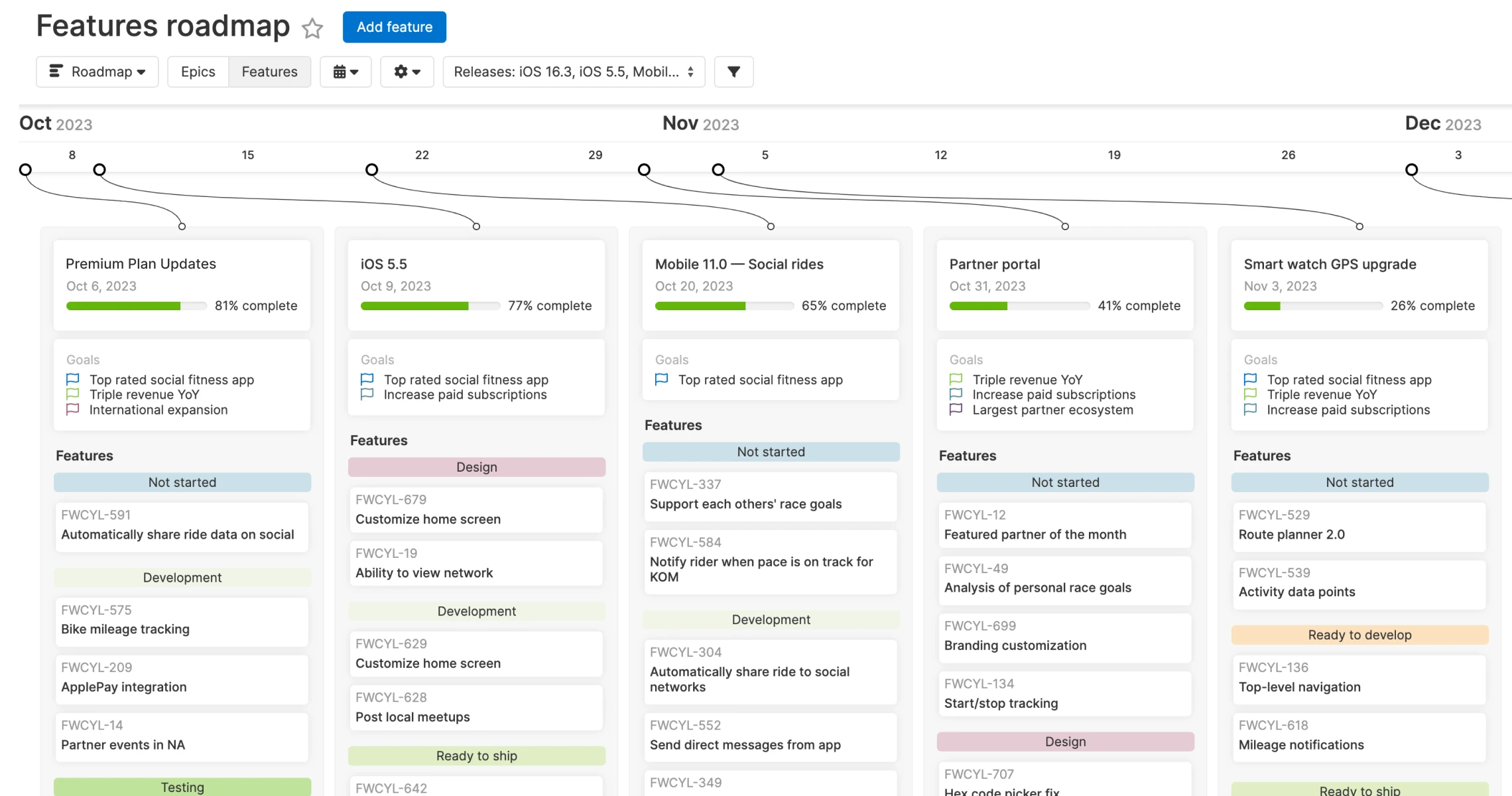
The features roadmap has a new look — with updated styling, improved timeline controls, and enhanced customizations — to showcase your plans with exceptional clarity.
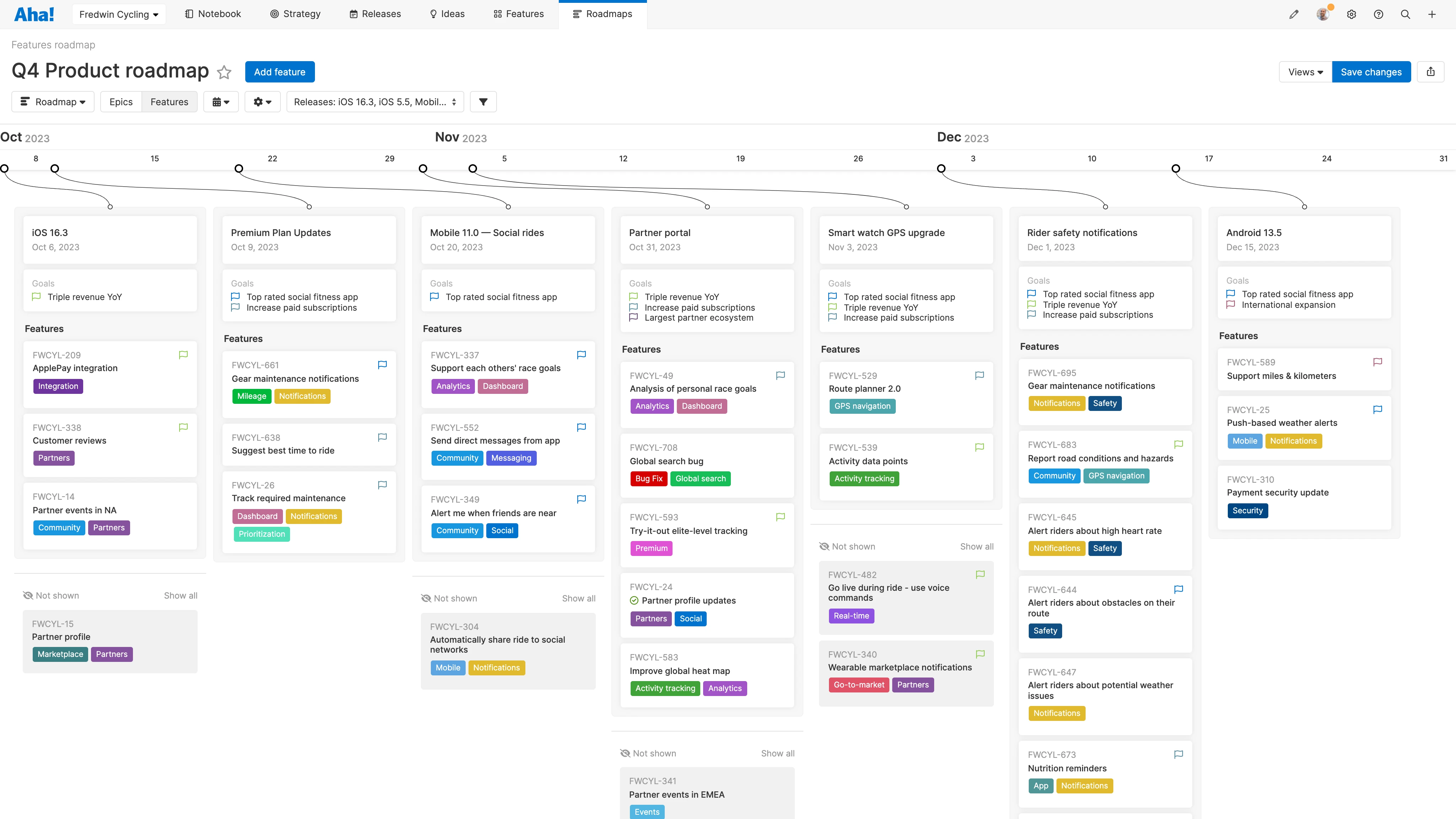
The first thing you will notice is that the updated design improves readability. Release columns are wider, so you can see more features in each release. Feature names are weighted more heavily so they stand out. Record fields got a visual refresh too — ensuring essential details about the work are easier to scan and absorb. And you will notice the bright blue checkboxes to hide features from presentations are gone. A more subtle grey eye icon gives you the same control without distracting from your bold plans. Unhide them all with one click, using the new Show all button at the bottom of the release column.
Next you will see improvements to the roadmap timeline. Previously if your roadmap showcased many releases, portions of the timeline might be off screen. This made it hard for viewers to quickly grasp the scope of your plans. Now, the full timeline is always in view — timeline markers clearly indicate when releases are scheduled. Click any marker and that release zips into view. No horizontal scrolling needed.
Finally, you have more control over the details you share on your roadmap. You could already highlight details for releases and features like status and progress, in addition to feature tags. And you could show the combined goals and initiatives for releases together with their features. Now you can choose whether you want to include goals and initiatives at the release level, the feature level, or both. And you can hide details like workspace name and feature reference numbers to keep focus on the most important information.
The updated design is now live in all Aha! Roadmaps accounts. It has been automatically applied to existing and new features and epics roadmaps.
Let's take a closer look:
Showcase your plans
Start by selecting the releases you want to show — then customize the details. Below, we wanted to share the Q4 plan with a customer-facing team. We added the goals connected to the features in each release — to show how our work links back to our strategy. We can easily hide features that are lower in priority to keep the view focused.
Clearly communicate the most important details about what is coming to drive alignment and generate excitement.
Now it is time to get your roadmap out there! Share a live view as a secure webpage or embed it into a presentation. Aha! Ideas Advanced customers can also share an external-facing features roadmap in their ideas portal with custom pages.
Sign up for a free trial of Aha! Roadmaps
Aha! Roadmaps is the best way to set strategy, prioritize features, and share visual plans. It includes Aha! Ideas Essentials for crowdsourcing feedback. If you are interested in an integrated product development approach, use Aha! Roadmaps and Aha! Develop together. Sign up for a free 30-day trial or join a live demo to see why more than 700,000 product builders trust our software to build lovable products and be happy doing it.


