Just Launched! — New Aha! Visual Charting Tool
We are excited to announce the launch of our new visual Aha! Chart tool which allows you to create visual reports based on all of your product roadmap data.
You can now visually report on everything in Aha! without having to enter the same roadmap data twice. This gets you out of Microsoft Excel and gives you the freedom to visualize everything related to product development in one place. And it makes you look like a product management superstar too!
Charts are a great tool for communicating information visually. And there are many ways you can use charts under the new Reports - Chart screen. You can share your progress with the broader team, or generate views for quarterly and annual business planning meetings. You can easily report on key ideas, releases, features, and even customer data.
Ultimately, this enables you to make better prioritization decisions and understand how well you are doing against your goals. And it helps you guarantee that everyone knows exactly what your team has accomplished.
The tool gives you the ability to report on just about any data that you have entered into Aha! These beautiful new charting capabilities allow you to generate charts from over 100 data fields.
Here are a few examples of what you can do:
Bar chart One of the most common charts is the Bar chart. One way you can use bar charts is to analyze feature score prioritization data. This will allow you to track the average value of the features that you are implementing, which helps keep you aligned against what matters more to customers.
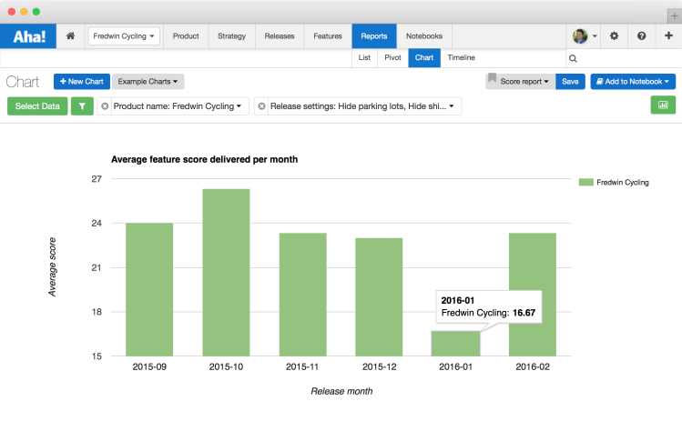
Above you can see the average feature score over the course of time, displayed as a bar chart. This chart averages feature scores, which can be done through the data configuration control in the charting tool.
Pie chart You have probably built at least a few pie charts in your day, right? But when was the last time you used one for managing ideas in your product backlog? Now you can. Using the new Chart tool, you can quickly assess and share the proportion of customer ideas which have been shipped or planned. This will keep the team focused on delivering the features that your customers want.
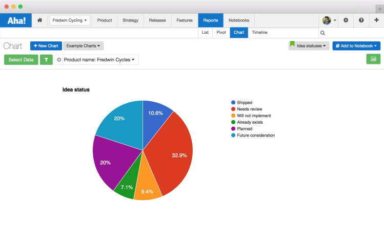
Above you can see a breakdown of ideas by their status displayed as a pie chart.
Line chart After a big product launch, you might want to show off the great work the team has done. And that is just fine by us. Using a line chart, you can create a “brag report” to highlight what the team has accomplished in a given period of time. So go ahead, brag a little bit (but make sure to throw the credit to the team).
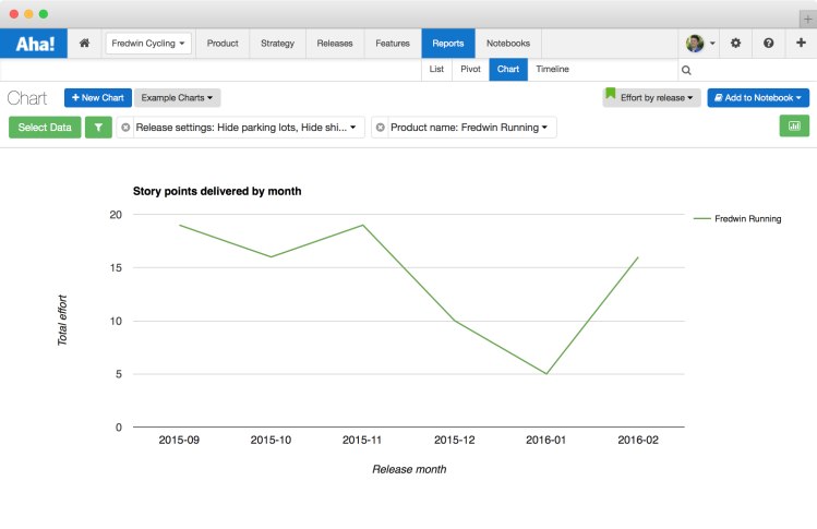
Above you can see story points delivered over time displayed as a line chart. This chart sums story points across all features by month.
Area chart Line charts and area charts may seem similar, but they each have a very different use case. It’s subtle but important to note the difference. One major advantage of area charts is that they can be used for multiple data series that are a part of a whole relationship.
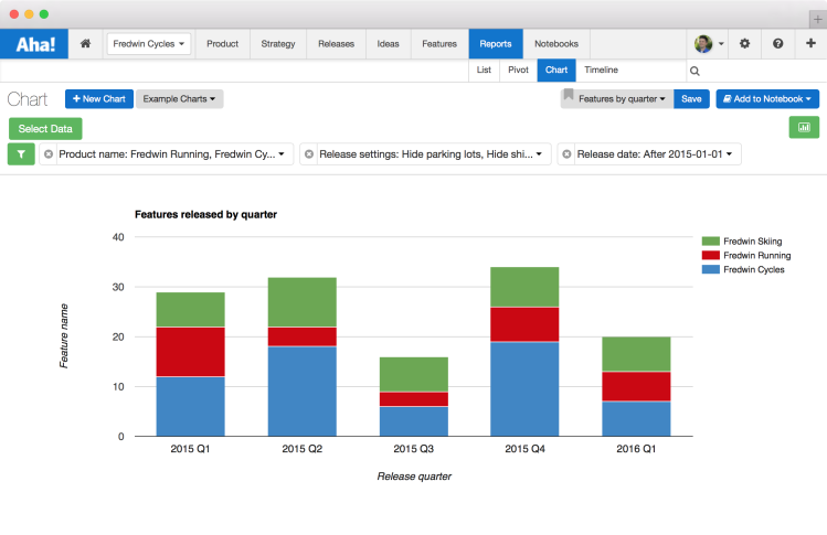
For example, you can use an area chart to easily generate detailed views for quarterly and annual business planning and team productivity. This lets you quickly visualize and quantify the total number of features that the team has shipped, and analyze which initiatives and goals the team has been focused on.
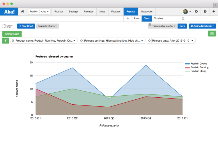
Above you can see features shipped by quarter across a product portfolio displayed as an area chart.
Configuration Ready to get started building your own charts? First, you need to understand who can view and build them. All Aha! users can view charts, and users in Aha! who have Product Owners or Contributor permission rights can create them for their products.
To help you get started, we have already provided several example charts that you can use.
Select from several pre-made example charts including: Features by quarter, ideas by status, and releases by quarter.
Once you are ready to build your own, just click the Select Data button to select what to show on your Chart. As mentioned above, you can choose from over 100 data objects in Aha! including any custom fields that you want to add as well.
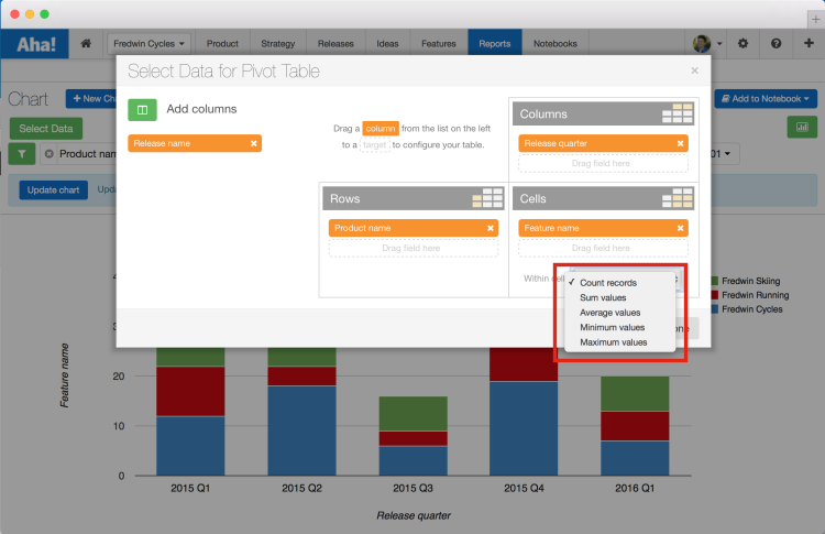
You can also create charts based on calculations (including totals, averages, min, max and count).
There are many ways to customize charts, including different chart options such as: bar charts, line charts, area charts, and pie graphs. You can find all of these options and more under the Chart Editor.
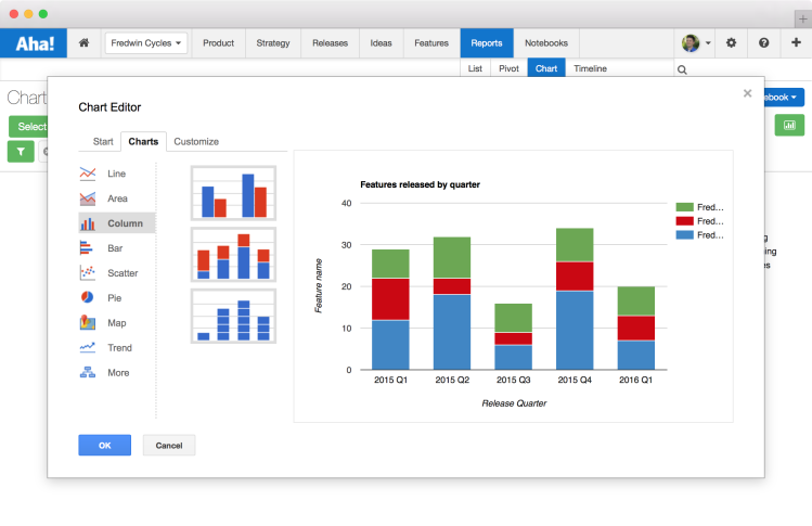
And to make your charts even more beautiful, you can customize chart visualizations with different colors, headers and labels. All of these options are available under each of the various chart types.
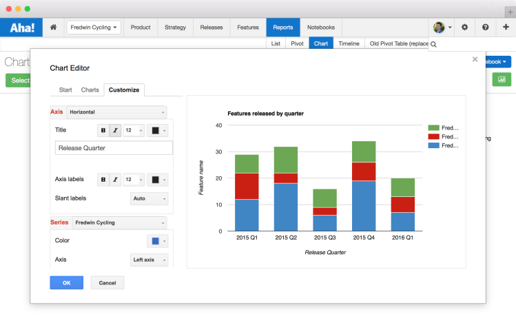
Using the Customize option you can change text, colors, formatting, and even adjust spacing.
We are particularly proud of these new capabilities because they are exactly what we always wanted to manage and report on our own products.
We know that a key responsibility for product managers is to create visual presentations that explain what they do and where their product is headed. And being able to take the data in Aha! and generate visual charts helps paint a picture of what is going on for colleagues, executives, customers and even investors.
So, we hope the new Chart tool inspires you to report on all the great information you have in Aha! — and sharing that information helps you and the team be your best.
The new charts visualization tool replaces the Old pivot table and contains all of the functionality of the Old pivot table, and much more. You can easily recreate any previous tables and views from the previous page by clicking the Select Data button and specifying the rows, columns and cells of interest. The old pivot table which will be available until March 2nd.
Sign up for a free Aha! trial — be happy Visual roadmap charts are available to all Aha! customers. If you are not already an Aha! customer, you may want to sign up for a free 30 day trial now. See why over 30,000 users trust Aha! to set product strategy, create visual roadmaps, prioritize features, and capture ideas.
