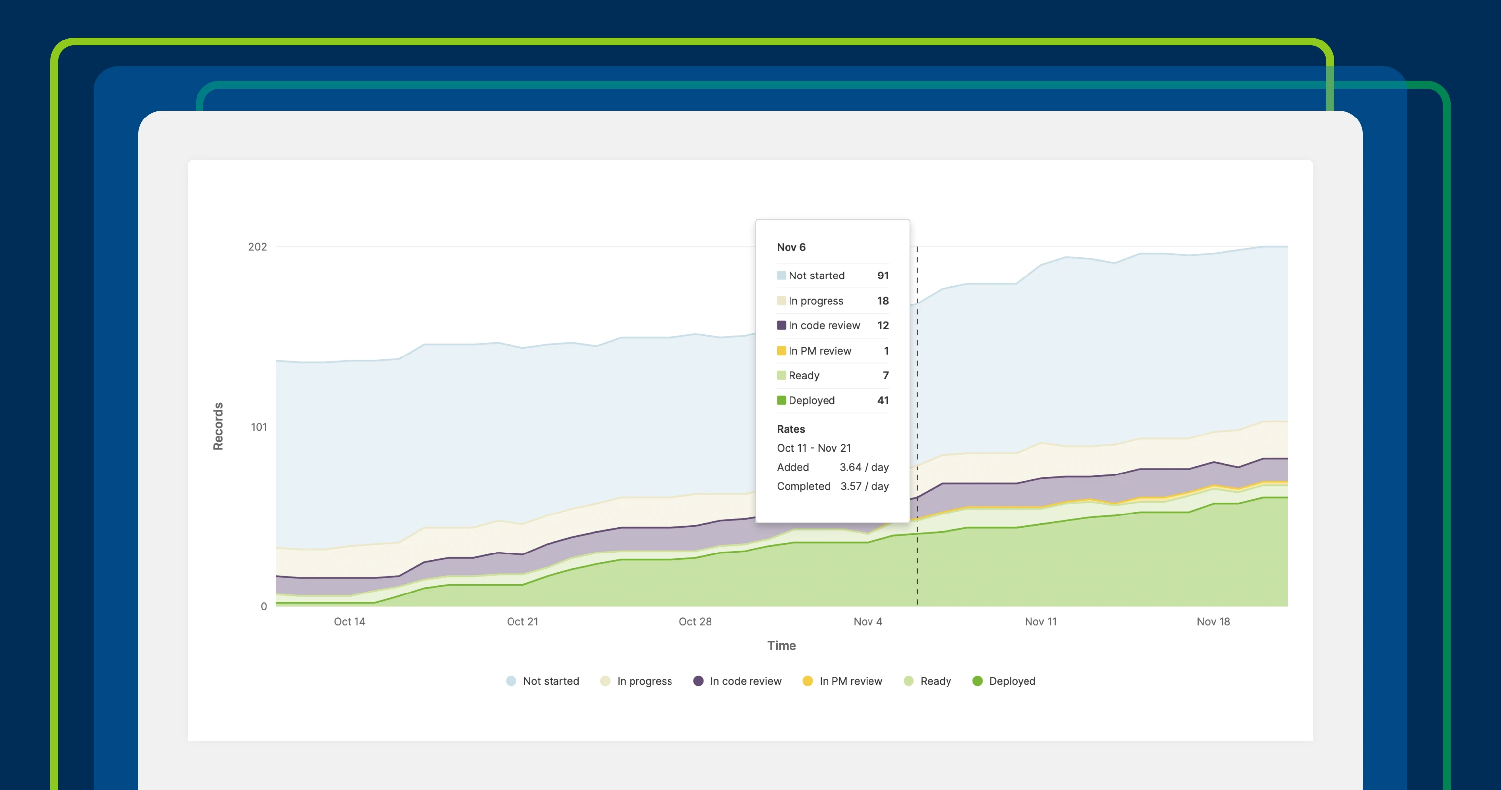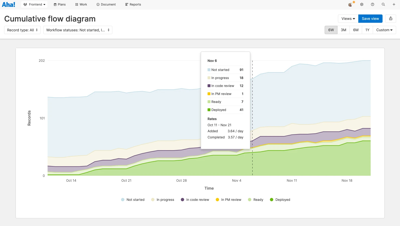
A cumulative flow diagram in Aha! Develop.
Track work with the new cumulative flow diagram in Aha! Develop
Managing the flow of work is essential for any agile team. The goal is to move tasks from start to finish as efficiently as possible so you can deliver value faster. Of course, optimizing workflow requires more than just tracking tasks visually on a workflow board. Questions such as "Where are the bottlenecks?" and "Are we starting more than we can finish?" demand deeper analysis. A cumulative flow diagram provides a clear, visual way to analyze work in progress and uncover opportunities to improve.
Try the new cumulative flow diagram in Aha! Develop to see how work progresses through your process — and identify ways to keep things moving.
The cumulative flow diagram helps you analyze how work flows through each stage of your process. Available as part of Aha! Develop Advanced, this type of diagram provides a visual representation of work items over time, segmented by workflow status. By tracking these trends, you can pinpoint bottlenecks, monitor team capacity, and ensure work moves efficiently through the system. You can find the diagram in the Reports section — along with other powerful agile metrics such as velocity, throughput, cycle and lead time, and burndown. (Contact us to get a demo or upgrade your account.)
You can tailor the diagram to fit your needs. Select the date range you want to analyze and choose the record types and workflow statuses to include. The chart displays the cumulative count of work items (collectively and within each status) over time. Hover over any point on the chart to see the exact number of items in each phase on a given day. You will also see how many items were added and completed during the time frame.
Analyze the width of the colored bands to assess how smoothly work flows through your process. In the example chart below, the bands are roughly the same width and rise in parallel over time. This indicates a consistent pace of work through the process. However, if a band widens significantly, it signals a potential bottleneck or delay in a particular phase. Conversely, a band that narrows could suggest underutilized team capacity or a gap in workflow balance.
Once you identify areas for improvement, take action. Address bottlenecks by adjusting work-in-progress limits, redistributing workloads, or refining processes to improve flow. Then, revisit the cumulative flow diagram to see the impact of your changes and refine further (as needed).
Continuous improvement starts with understanding your process and making the changes that matter most.
The cumulative flow diagram is an essential tool for any agile team. It does more than just visualize workflow trends — it helps you build a better process over time. By identifying inefficiencies and tracking progress, you can make targeted improvements that increase delivery speed and reduce wasted effort. And when it is time to share these important insights, remember that you can also add the report to dashboards, notes, and whiteboards in Aha! Roadmaps to make engineering performance more visible across the organization.
Sign up for a free trial of Aha! software — build lovable products
Aha! Develop helps agile development teams connect to the roadmap, optimize workload, and streamline delivery. Aha! Roadmaps is the best way to set strategy, prioritize features, and share visual plans. Use both tools together to create the perfect product development environment. Sign up for a free 30-day trial or join a live demo to see why more than 1 million product builders trust our software to build lovable products and be happy doing it.


