Just Launched! — New Visual Reports to Analyze Your Product Roadmap
We know that it can be painful to spend tons of time duplicating data and manipulating spreadsheets to report on your product management activities. That is why leading product managers use Aha! to create beautiful roadmaps and analyze everything that their teams are working on.
Today we are excited to announce several improvements to our visual charting tool, which enables you to analyze and report on everything product management.
We just expanded our capabilities to provide even more reporting and visualization options for product managers, including scatter, bubble, and organizational charts. These new chart types expand on the beautiful bar, line, and pie charts you can currently create in Aha!
These new visualizations can be used to analyze all of the data in Aha! In particular, they will help you make better prioritization decisions and communicate progress to your team. Here are several examples of how these new charts make life as a product manager better:
Easily generate beautiful charts Get out of spreadsheets and report on everything related to your product management work in one place. First, build a list view with columns of data that you are interested in using to generate a report. After adding the columns you can re-organize them and add filters to create views that reflect your needs. Then, select the Chart Data button to create beautiful visualizations of your product data.
Communicate strategy alignment across the portfolio One of the new visualizations is the organizational chart. You can use this chart to show anything with a hierarchy in Aha! For example, it is perfect for highlighting how your goals or initiatives roll up and are linked. This ensures that your entire product development team is on the same page and driving towards the same corporate goals.
Report on team progress A second type of chart we have introduced is the bubble chart. Use these to quickly display the value your product team is delivering, and communicate this value across the organization. For example, using bubble charts you can visualize the revenue achieved for each of your strategic initiatives and understand the correlation between your scorecard metrics and that revenue. This is a sophisticated chart that requires you to add custom fields to your initiatives to capture strategic fit and revenue achieved, but it highlights what’s possible.
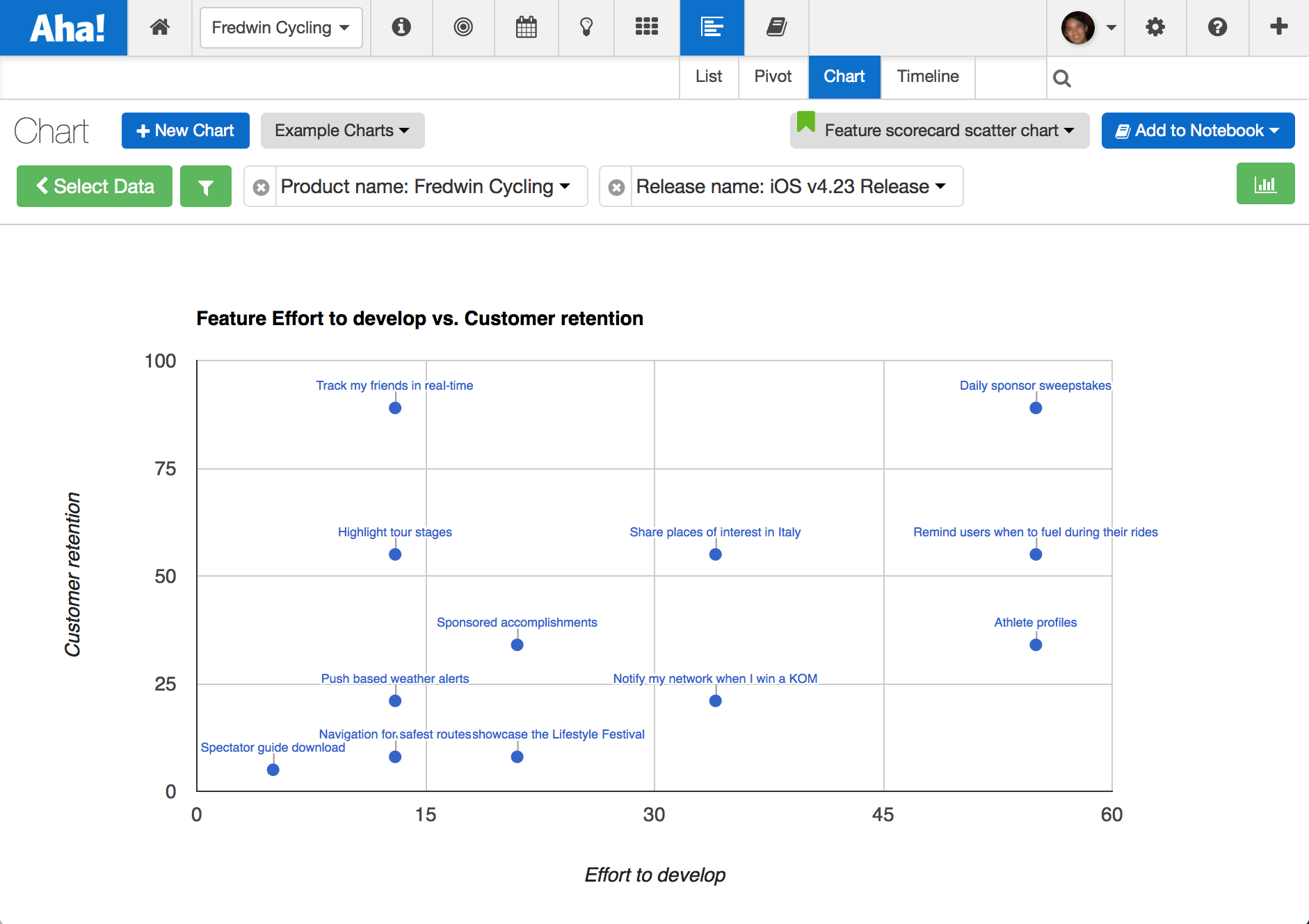
Make better prioritization decisions Finally, use a scatter chart to make better prioritization decisions by analyzing the relative value and effort (as well as other scorecard metrics) for your initiatives, features, and ideas. Scatter charts make it clear which features product and engineering teams should be working on.

It’s easy to create beautiful visual reports across any set of custom scorecard metrics.
Start by selecting a chart from the Example Charts dropdown. You can customize your charts from a selection of styles and themes — and even adjust colors to match names, status, and custom fields by selecting the Customize Chart button. And you only have to create the report once to save the views. Share your saved views with your team to ensure that everyone is looking at the same information.
These new reports allow you to easily generate stunning visualizations that can help you leverage your strategy and product roadmap data to make better decisions and share your plans with the team. And best of all, you can do all of this without having to enter the same data multiple times.
Sign up for a free Aha! trial — be happy The ability to create brilliant reports is available to all Aha! customers. If you are not already an Aha! customer, you may want to sign up for a free 30 day trial now. See why over 50,000 users trust Aha! to set product strategy, create visual roadmaps, prioritize features, and capture ideas.
