
The 7 Report Templates Every Product Manager Needs
Spreadsheets are the worst. There, I said it. They are cumbersome to use. Disconnected from product strategy. And the data is never accurate for long. So you find yourself painstakingly updating the same reports again and again. It is frustrating and time-intensive. You want to spend your time building features — not just reporting on them.
Efficient, versatile reports — product managers need a better way to view product and team success.
Your reports should look good and reveal where you are making progress. You also want to be able to filter and sort data to show different views — product goals by status, ideas submitted by customers, and planned features, just to name a few. No matter which view you are building, you need a consistent way to get the most from your data and show the value of your work.
This is why Aha! Roadmaps includes over 75 reporting templates to help kickstart your analysis. You can access more than 200 data fields and create additional fields to customize list reports, pivot tables, and charts. Then, view multiple reports on an interactive dashboard to see all KPIs in one place.
These reporting options are super powerful. But if you are new to Aha! there is a lot to choose from. So I also asked our team to share their favorites. Here are the top reports we find ourselves frequently recommending to customers:
Progress and status of goals
"Your strategic plans should be dynamic. But once product teams define and set strategy, it is easy to fall into the trap of 'set and forget.' You will progress faster if you can reference strategy as part of your everyday work. This is where a goals by progress and status report is valuable. Whether you use OKRs or another goal-setting framework, you can view the success metrics and progress against them so far — and see how the tactical work is contributing to your business outcomes." — Claire George
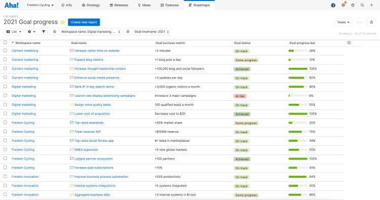
Add a progress field to individual goals and automatically calculate it from related initiatives.
Strategy roadmap
“Product managers need to report on status to leadership and other teams. The strategy roadmap in Aha! is perfect for this. It is a great way to start with the high-level themes and then interactively expand into each one to show the related epics and features as questions arise. That way you avoid too much noise in one view and can selectively choose where you zoom in." — Deirdre Clarke
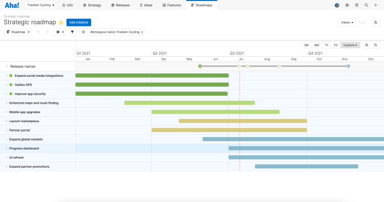
Customize your roadmap by coloring the initiative bars by status.
Initiative cost by product
"A go-to report of mine is a pivot table for calculating initiative cost by product. I use a worksheet on the initiatives that summarizes my total spend based on aligned features. In addition to ensuring the team is focused on strategically important work, leadership wants to see the actual cost of what has been prioritized. With this report, you can easily tell that story in an automated fashion because it fits right into your day-to-day workflow." — Jennifer Bloom
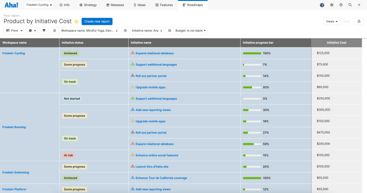
Custom worksheets are available for Enterprise+ customers to perform powerful data analysis.
Trending ideas by category
"Knowing what your customers want and how that relates to your product helps you build lovable features. I recommend this chart view of trending ideas grouped by product category. You can pinpoint the areas your customers are most interested in and use these insights for decision-making. Adding the idea status in to further slice the data helps leadership see exactly where the team is in the planning process — providing transparency into next steps." — Erin Ward
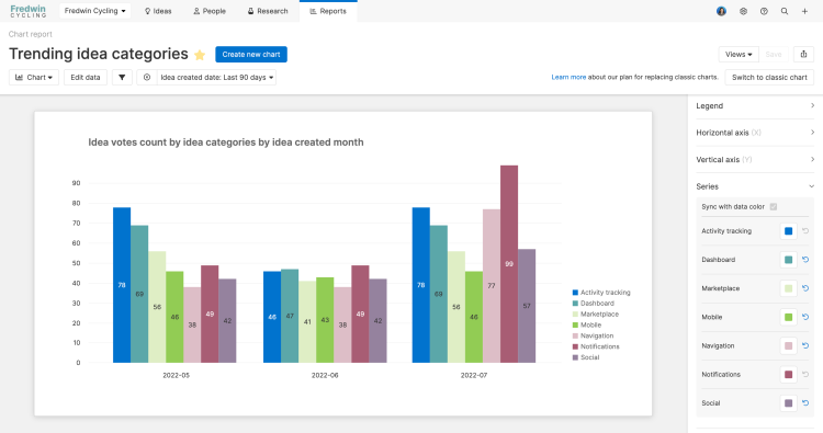
Share ideas insights by adding the report to an Aha! presentation or generating a secure webpage.
Ideas grouped by segment
"I love looking at the ideas that customers submit. Seeing the ideas grouped by organization or segment is a great way to understand which types of customers voted for a particular idea. Then add idea statuses for 'in review,' 'under consideration,' and 'planned' to show how well you are meeting those needs." — Tom Bailey
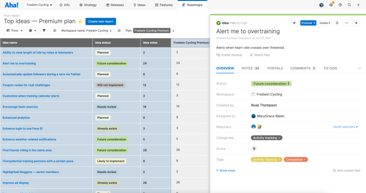
Organizations are part of the Ideas Advanced plan for expanding how you collect feedback.
Workflow calendar
"The calendar report provides a nice visual for all your in-progress work. It is helpful for staying on top of everything assigned to cross-functional team members, such as your product marketing teammates, in advance of a launch. The to-dos option is one of my favorite ways to use the calendar view — completed to-dos are marked in green, upcoming in gray, and overdue in red. Even better, the report is totally configurable so you can display the most relevant information for your team." — Matt Case
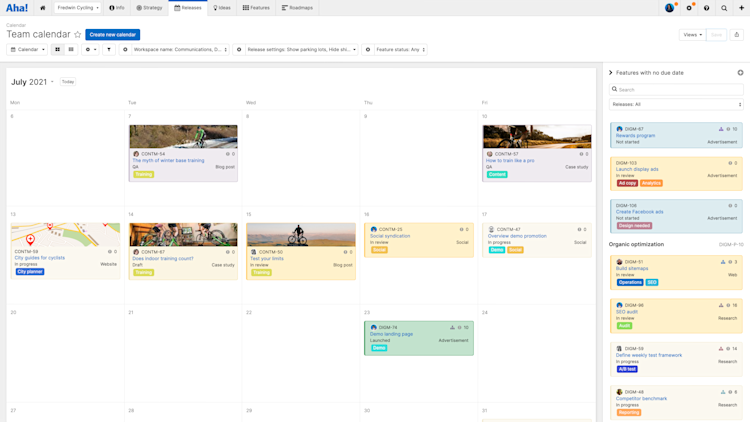
If you add attachments on your records, the first one will be the cover image on the calendar report.
Features shipped by month
"Product managers need to measure their velocity. One of the best ways to do this is with a features shipped each month's report. I like to create this as a stacked column chart like the one below. This way you can compare the number of features shipped for each product in your portfolio over time. Do not forget to stop and celebrate how much you have accomplished!" — Rose Thompson
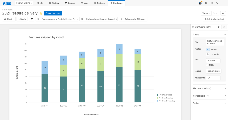
Instantly convert your chart into a pivot table using the Change view type dropdown.
When Aha! is the single source of truth for your product plans, you can turn any product data into a compelling visualization.
Consider which reports you need to showcase your team's accomplishments or prioritize upcoming work. Product reporting can be so much more than a tedious necessity — it can be downright thrilling to visualize the results of your efforts and anticipate what lies ahead.
What reports do you use the most as a product manager?
Build beautiful product reports in Aha! — start a free 30-day trial.


