Just Launched! — How We Redesigned the Aha! User Interface
We just passed 50,000 users and over 1,500,000 user stories are now managed in Aha! Wow — that’s a lot of features and roadmaps. It’s humbling to stop and consider the growth. And with thousands of customers using Aha! to set strategy and manage their products, we are always looking at ways to make it more fun.
So, we decided to take a closer look at the user interface across the entire application. That took some courage. And we decided that we could dramatically improve how you add, update, and view information in Aha! (It was obvious actually.)
Today we are enhancing the entire Aha! user experience — making it much easier to create, update, and view key information about your strategy and products.
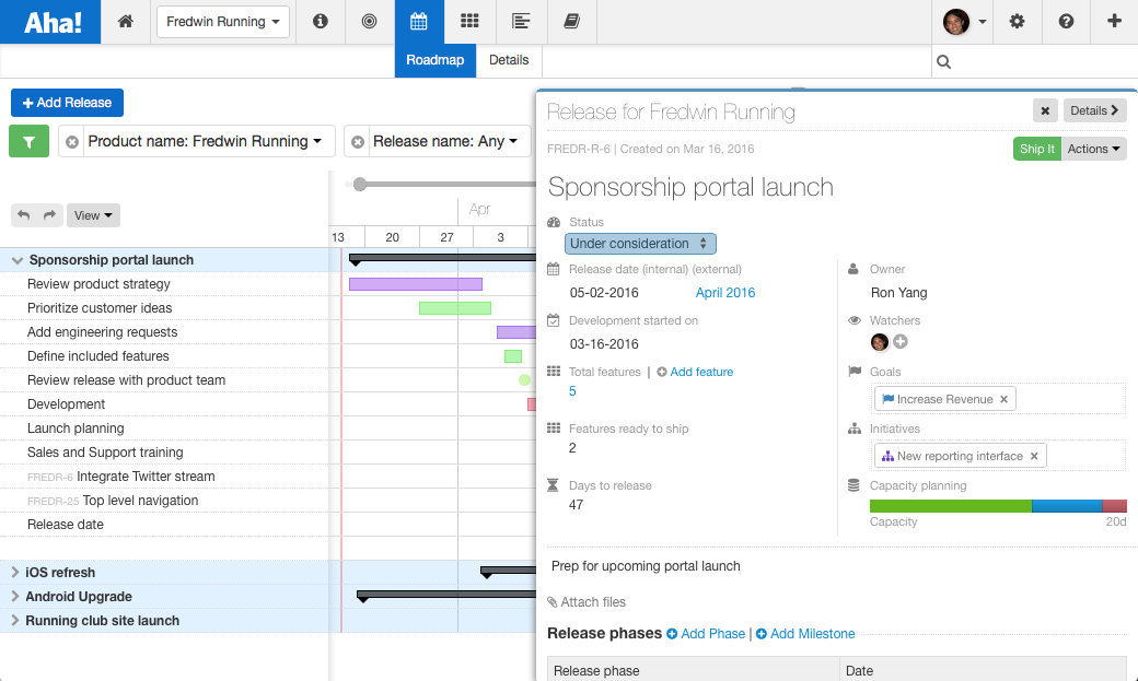
We just launched a new and improved UI for the parts of the application that you use most. The interface creates a clear, consistent design across the entire application including: product, strategy, releases, features, and ideas.
We have been using the new design over the last week and have found the clean new user interface and experience to be more enjoyable to use and look at. We hope you will too. The changes also make it easy to quickly scan pages to find the most important information.
Ultimately, a lot of research and work went into this launch. And there were several key takeaways we thought would be beneficial to share with you. So, let’s take a quick look at what we did.
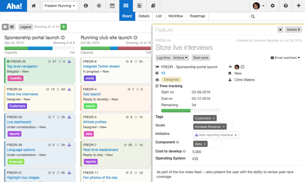
Simplified user experience When we looked at our previous designs, we often felt that the information could be displayed better to show the most important data. We knew there had to be a better way, especially when dealing with hundreds of features each month ourselves. So, the logical place to start was by improving how features are presented. Here is what it looked like before.

Above, a feature drawer is shown as it appeared in our previous design.
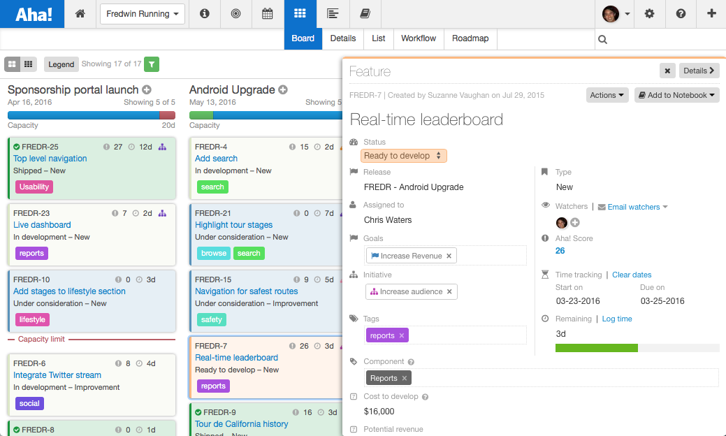
We have simplified the user experience to place a greater emphasis on the data you enter vs. the titles of the fields. This resulted in a cleaner interface.

Above, a feature drawer is shown in the new Aha! design.
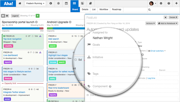
Optimized data fields Data fields do not sound very exciting, but you use them every day. So, we have also top-aligned form labels to allow you to more easily and more quickly add and update information. According to best practices, top-aligned form labels result in the fastest completion times, which means less time on forms and more time doing meaningful thinking.

Above, a feature drawer is shown zoomed in on an empty group of form fields.
Improved productivity We have standardized the placement of common elements across the entire application so that you can easily view and update information in a single place no matter what you are working on. We have also reconciled what goes where and have tried to more intelligently group related items.
Highlighting status We know you like shipping new features just as much as we do. So, we also standardized the location of status across the entire application. Now the status of each item is displayed as the first and most prominent field on the top left. This enables you to quickly see the status of your goals, initiatives, releases, features, and ideas.
Each day, thousands of records are created, updated, and viewed in Aha! — and when you look at a feature or user story, you want to see the most important information in just a quick glance.
The most important lesson we learned was the following — you need to keep improving the most fundamental elements of your application. So, no matter how fast we are growing or how big we get, we will continue to focus on the core user experience and make Aha! more efficient and enjoyable for you (and us) to use.
Sign up for a free Aha! trial — be happy Our new redesigned user experience is available to all Aha! customers. If you are not already an Aha! customer, you may want to sign up for a free 30 day trial now. See why over 50,000 users trust Aha! to set product strategy, create visual roadmaps, prioritize features, and capture ideas.
