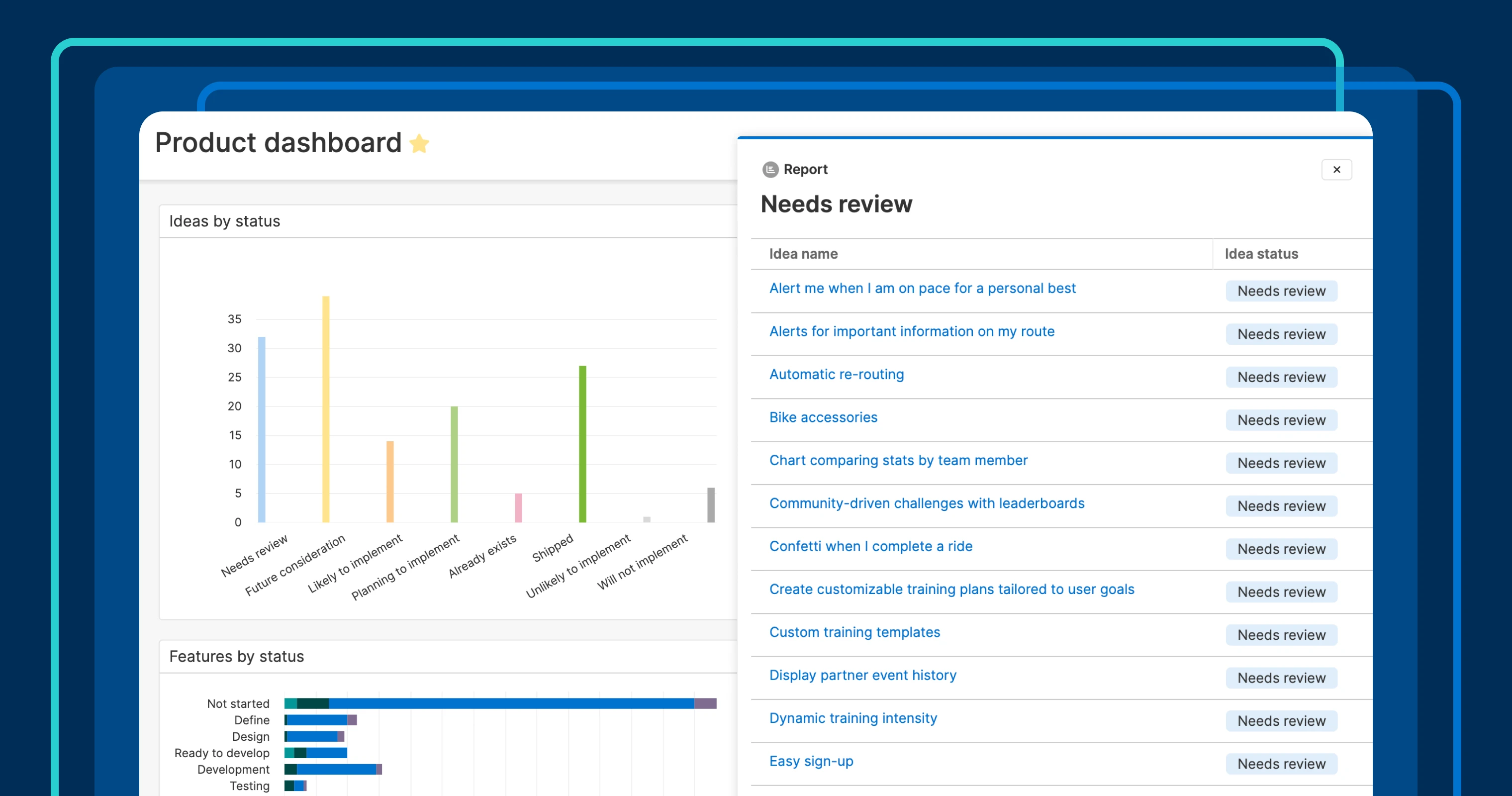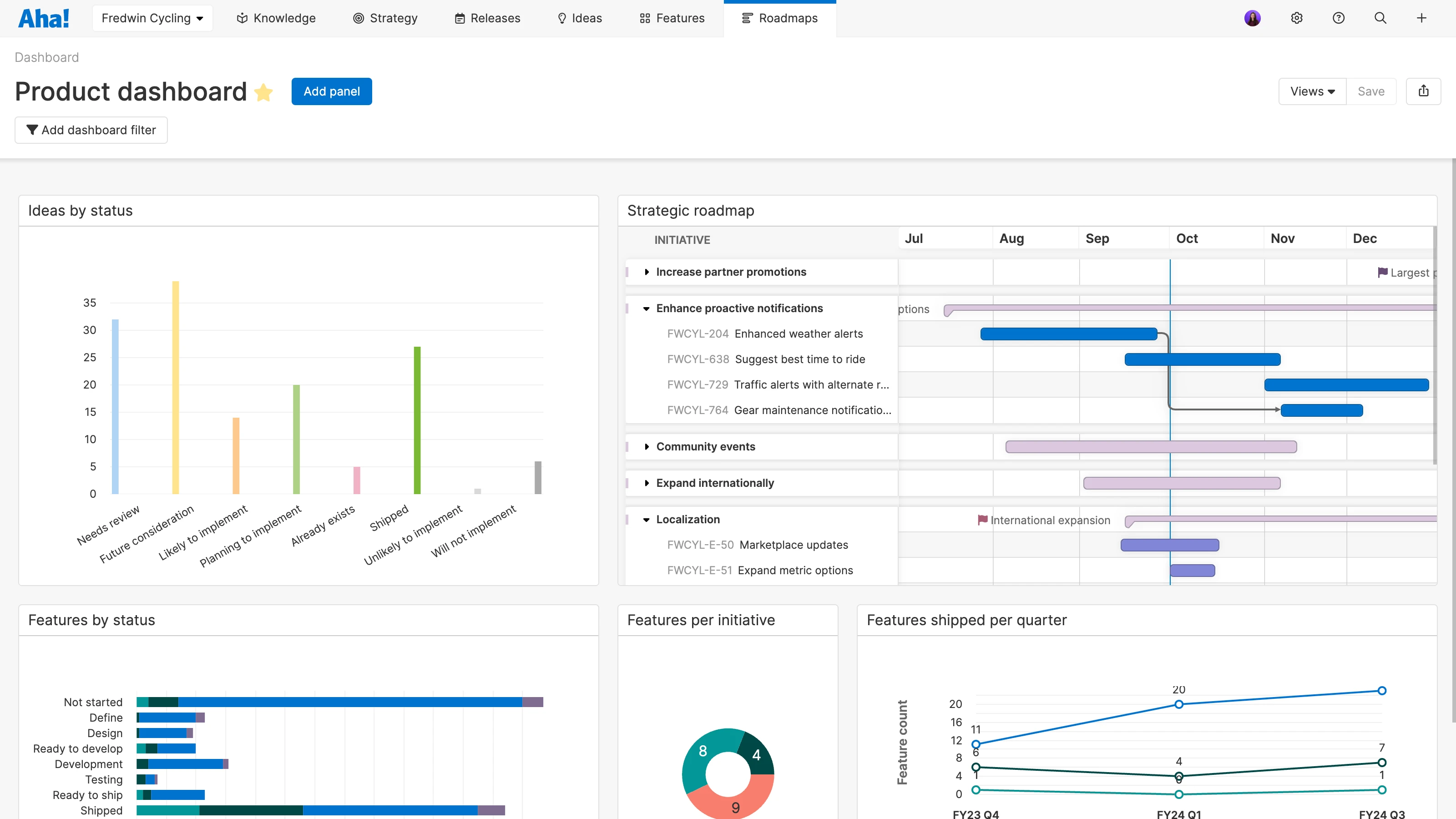
A chart drill-in from a dashboard in Aha! Roadmaps
Drill into product reports that are on a dashboard
Dashboards in Aha! Roadmaps are a powerful way to bring together multiple reports in one view. This makes them a great option for consolidating and discussing product data with teammates and stakeholders. And they are more useful now because you can explore the data in every report in greater depth.
Drill into the data that fuels your charts for deeper insights and additional transparency, right from a dashboard.
Your dashboards likely include roadmaps and a variety of key charts. Even if you are pretty familiar with the data behind the views, your teammates might want to take a closer look. For example, you can explore a roadmap's details by clicking on a planned feature to better understand its value. This means you no longer need to leave the dashboard to review its details.
The new drill-ins capability gives you quick insights into the underlying data in a chart. You can even control the details that appear by customizing the underlying report. It is possible to add helpful fields or rearrange columns so the most useful data is displayed.
Note that drill-ins will not work for our former chart style, classic charts. If you are still using classic charts, we encourage you to try our new charts to take advantage of all the latest features — including drill-ins, updated color options, and customization settings. Let us know if you need guidance on recreating classic charts.
Here is a look at how to use chart drill-ins on a dashboard:
Design your ultimate dashboard
Let's imagine that we want to bring essential product data together in a single view. Here, we have a product dashboard for a fictitious company called Fredwin Cycling. This dashboard showcases our roadmap along with other key charts, including ideas categorized by status and features shipped per quarter. This gives our team a convenient way to view product plans and progress at a glance.
Uncover the data
Now, someone on the team is curious as to which ideas need review. Let's drill into the chart that shows ideas by status to find out. Click on the Needs review bar. A drawer appears with a complete list of these ideas.
But it would be even better to see the vote count as well so the team can consider how popular each idea is. Open the report and switch to the list view to add a column for the vote count. Save the chart and go back to the dashboard. Now, when we drill into the chart, we see all the data we need to answer the question and suggest what we should focus on.
Swiftly explore information and find answers by reviewing the data behind your compelling visuals.
If you are excited about bringing together powerful views but do not know where to start, we can help. Check out our recorded tutorial on dashboards to see what is possible. Aha! product experts walk you through how to build three different dashboards to monitor strategic objectives, evaluate feature delivery, and track customer feedback. Follow along to build these impactful views in your own account.
Start a free trial of Aha! Roadmaps
Aha! Roadmaps is the best way to set strategy, prioritize features, and share visual plans. It also includes everything in Aha! Ideas Essentials, Aha! Whiteboards Essentials, and Aha! Knowledge Essentials to provide a complete product management solution. Sign up for a free 30-day trial or join a live demo to see why more than 1 million product builders trust our software to build lovable products and be happy doing it.


