Aha! Roadmaps | Step-by-step examples: List reports, pivot tables, and custom roadmaps
Your Aha! Roadmaps account connects you to hundreds of data objects that you can report on, and each report and roadmap visualizes your data differently. You can even use the same data in different reports to highlight different insights.
In this article, we will walk through two reports and a roadmap using the same basic data set. Before we begin, it can be helpful to think about how the Aha! Roadmaps reporting model works. Reports are built around relationships between record types, and the order you add related record types to your report matters. As you work through the report builder, try experimenting with different record types, and see how it affects the report you create.
Click any of the following links to skip ahead:
Example scenario
Let's pretend you are a product manager, and you want to see each product release and its features with status, score, assignee, and remaining estimates.
In this case, you need a report that:
Includes feature assignee.
Includes feature status.
Includes feature score.
Shows how much work remains for each feature.
Is organized by product workspace and release.
At its heart, the main data of this report all about features. Remember that for later. Next, you will determine which report type you want and how to add the data.
Create a list report
Let's start with a list report. This is a good choice for a first report type, since it lays out your data in columns and rows. Navigate to Roadmaps List to get started.
Click the Create new report button. This will open the Create report interactive modal, which will walk you through the process.
The report we are building will ultimately contain data columns from the feature, release, and workspace tables. In referencing the data model, the feature table is the lowest-level table in the hierarchy, so that is where to start.
At this point, you can check for example reports that fit our need. Click Use example list report to see a list of popular example reports. To see a full list of the more than 75 example reports, navigate to Roadmaps Overview and click Example reports.
Let's choose to Create your own list report. In the Select records step, select Features, then Features with releases. Click Next.
In the Add fields step, add the following fields:
For Features, Feature assigned to, Feature name, Feature remaining effort, Feature score, and Feature status.
For Releases, Release date and Release name.
For Workspaces, Workspace name.
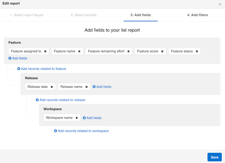
In the Add filters step, add any filters you need to see your data more clearly, such as filtering by Workspace name, or Release date.
When you are ready, click Create report to create your list report!
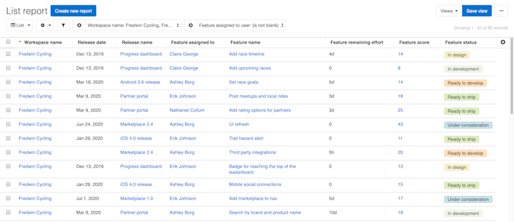
Create a pivot table
For senior level stakeholders, you want a more visually appealing Pivot table view. Click on the Change report type dropdown in the upper lefthand corner of your list report to pivot your data. All that remains is making a few modifications as to which data columns to include and how to organize them.
Click the Customize view dropdown, then click Edit data to add fields and filters to your pivot table.
The Add fields window allows you to perform three primary functions:
Add new data columns to your report using the Record hierarchy section.
Organize your data columns into pivot table columns, rows, and cells. Data columns placed in the Columns target are displayed across the top of the table serving as column headers. Data columns placed in the Rows target are displayed on the left of the table serving as row headers. Data columns placed in the Cells target are the values featured in the report grid.
Click a field to add it to Rows, Columns or Cells in your pivot report.
Add Workspace name to the Columns target.
Add Release name to the Rows target.
Add Feature reference #, Feature name, and Feature status to the Cells target.
Choose to List unique records within cells.
Any remaining columns will not show in the pivot table report, but can be useful when customizing the report theme and colors.
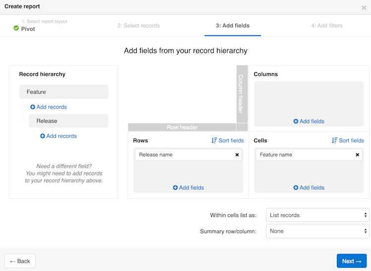
Click Save to create your report!
Customize your pivot table
With your report created, you can click Customize view dropdown to customize aspects of the report, such as coloring the records.
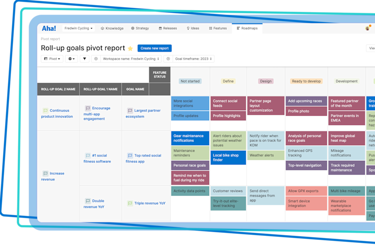
In both the List and Pivot views, you have the added benefit of being able to sort your data columns using the Sort button to sort on single or multiple cell values in either ascending or descending order. In list reports, use the column header to sort the data, or click Customize view Sort columns. In pivot reports, click Customize view Edit data, then the appropriate sort button.
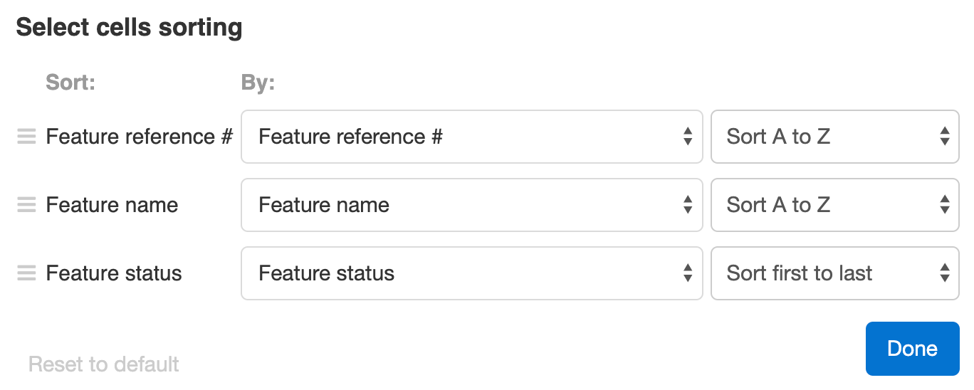
Pivot tables and list reports have the added option of a sorting hierarchy. For example, the cells in our example pivot table are sorted first by Feature reference #, then alphabetically by Feature name, and finally by Feature status. Drag fields into a different order if you prefer, adjust what the fields are sorted by, and select the type of sorting you need. Click Done to save your changes.
Create a custom roadmap
The custom roadmap view allows you to create a custom roadmap for viewing deliverables on an intuitive timescale. Use it to create roadmaps on any Aha! Roadmaps data objects that are time-based, such as initiatives, releases, features, and custom fields. Navigate to Roadmaps Custom, then click on Customize view to use the data columns from your list and pivot reports as your starting point.
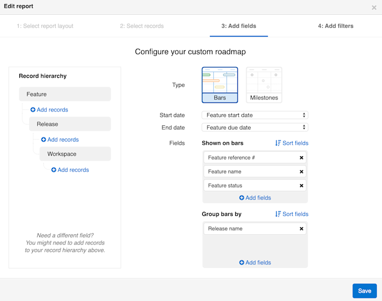
From the Add fields step of the report builder, you can add record types and fields as you did in the reports you just built. Since this is a roadmap, you can also choose whether to visualize your data by Bars, which show a date range, or by Milestones, which show a single date.
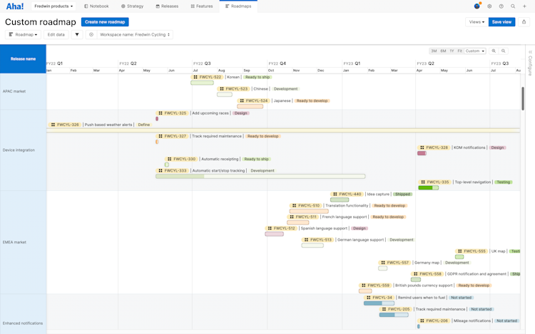
If you build your custom roadmap with Bars, records without dates will display on your roadmap, as indicated by bars with fuzzy borders that span the width of your roadmap. You can add dates to these records to resolve the fuzzy borders, or click the Add filters + icon to add a quick date-based filter, then filter out records without dates.
Whether you choose Bars or Dots for your custom roadmap, you can still view linked records by hovering over a roadmap element and clicking the View linked records button.
Customize your custom roadmap
Use the collapsible sidebar on the right side of your roadmap to customize it — show or hide progress, dependency lines, adjust the theme, add milestones, and more.
You can also click the Add filters button to move to that step of the report builder and add advanced filters to further focus your roadmap, or hover over the filters bar at the top of the page and click the Add filters + icon to quickly add basic filters.
Save your views
To save your current view, click the Save view button in the top right corner of the page. When you save a view, you will have the option to name it, choose who you wish to share your saved view with, and select if others can edit the view. The Views dropdown lets you access any view you have ever saved.
Create a dashboard
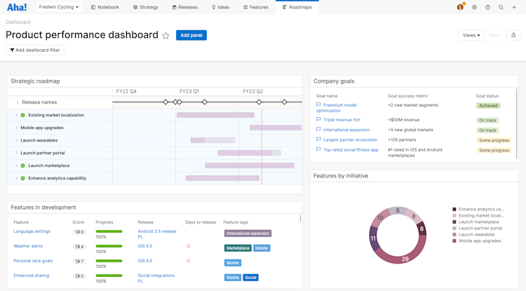
Every report and roadmap type we've discussed here (as well as many others such as charts, Gantts, and workflow boards) can also be added to a dashboard. Dashboards consolidate Aha! Roadmaps views into a single page. As you become familiar with these views to organize and analyze your data, think about how you might use a dashboard to communicate the insights they provide.
Share your reports
With your reports and roadmaps completed, you can easily share them with your stakeholders by selecting one of the export options under the Share button on the top-right of the page.
You can share dashboards with your teammates too! Because dashboards are a collection of reports and roadmaps in panels, there are a few differences in how you share them in presentations or as webpages. Click here to read about sharing dashboards, or click the Share menu at the top of a dashboard to get started yourself.
To fold your reports into a presentation, select Add to presentation. In your presentation, you can select the reports' update frequency.
To invite people outside of your Aha! Roadmaps account to view your reports, select Share as webpage.
To schedule recurring email delivery of your report, select Schedule email delivery.
To export your list report for further analysis, select Export to Excel or Export to CSV. You can import from CSV to update data later.
For a static version of your reports, export your report to PNG image or PDF document.