How to build a dark theme
So you want to implement a dark theme for your app? All your favorite applications have it and your app should too. But will it be trivial or is it as daunting as it seems? Where do you even start?
You can break the process down into three different phases: choosing the technology you are going to use, building up your color palette, and applying the changes to your site. We went on the same journey at Aha! to add a dark theme to our agile development tool Aha! Develop. Here is an example of what it looks like in action.

Here is a breakdown of each of those steps.
Choosing the technology
The first thing you need to do is decide on the underlying CSS technology you are going to use to implement your colors. You might already be using a CSS preprocessor like LESS or SASS, and you might even have some color variables already defined. It seems natural to use these to solve theming, right? Probably not.
Imagine a simple CSS rule in your app today.
p {
  color: @textColor;
}
How would you apply dark mode to this? Intuitively, you would have a second set of color definitions for dark mode.
/* light_mode.less */

@textColor: #333;

/* dark_mode.less */

@textColor: #999;
But this doesn't help a preprocessor. They compile all your code into CSS in one pass. You would have to do two compilations into two entirely different theme bundles, one with the dark variables and one with light. Additionally, you have to manage downloading and using the proper stylesheet on the client's browser. Or you could have them download both sets and switch between which is being used, but this would impact performance. None of this is ideal. The next logical step is redefining the rule with an explicit dark mode variable.
@lightTextColor: #333;
@darkTextColor: #999;

p {
  color: @lightTextColor;
}

[data-theme='dark'] {
  p {
    color: @darkTextColor;
  }
}
That is going to be a huge mess to maintain. The larger your CSS codebase, the more exception rules you have for dark mode.
So what are you going to do? There is a better way.
CSS custom properties
CSS custom properties, sometimes known as CSS variables, seem custom-tailored to solve this problem. You simply define a set of variables that have different values depending on the theme.
root: {
  --text-color: #333;
  --background-color: #fff;
}

body.dark-mode {
  --text-color: #999;
  --background-color: #222;
}

p {
  color: var(--text-color);
  background-color: var(--background-color);
}
All you have to do is apply a dark-mode class to the body and everything will instantly change.
There are lots of great resources out there for learning how to use CSS custom properties like this one.
Building your color palette
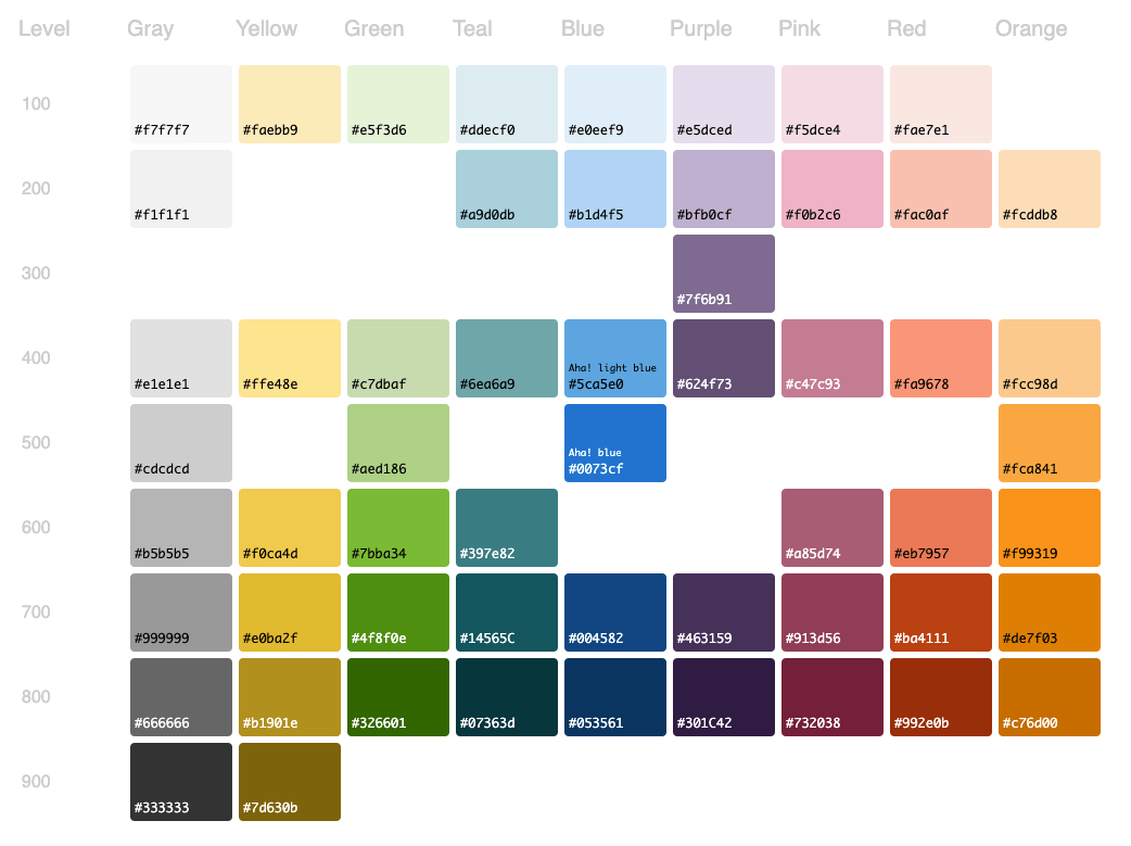
Now that you have settled on the technology, it's time to write code, right? Almost. Now is the time to really plan ahead and set up a good color design system. Work with the interested parties, such as design and marketing, to come up with a scheme you can all agree on. Lack of consensus now can lead to a huge effort to refactor your colors again in the future. However, if you follow the naming scheme described later in this article, it won't be so bad even if you totally overhaul your palette. Here is what we came up with at Aha!

There are lots of good posts on color naming conventions. Here is a quick summary of the three most common approaches.
Semantic naming
You could name the colors after their function in the application. The problem with this approach is the number of times you will have to repeat the hex values. You might use the same color for text as you do for borders. Repeating the hex values will inevitably lead to someone creating just one more variable with one more hex code that isn't in your palette. So this scheme is out for now, but stay tuned, you have not seen the last of semantic naming.
--color-primary-text: #333;
--color-secondary-text: #999;
--color-danger: #f00;
--color-background: #fff;
Fun naming
You can also give each color a memorable name. Aesthetically, this one takes the cake. But you probably already have enough lists of classes and functions stored in your head already; you don't need another list to memorize.
--color-indigo: #4b0082;
--color-fire: #f3ba1c;
--color-firefly: #f9f925;
--color-old-van: #b6b5b1;
Mathematical naming
A more mathematical approach is to number the various shades for each hue. It's not as pretty but it clearly defines the relationship between each variable and is easy to remember. Using a single digit is common and so is using 0-900. Using 0-900 will give you room to expand if you need it in the future and nicely mirrors the font-weight 100-900 scale. This makes it easy for both developers and designers to understand.
--color-red-100: #fae7e1;
--color-red-200: #fac0af;
--color-red-300: #faa0a1;
--color-red-400: #fa9678;
--color-red-500: #ef8a6c;
--color-red-600: #eb7957;
--color-red-700: #ba4111;
--color-red-800: #992e0b;
--color-red-900: #772507;
Let's go with mathematical naming.
Using custom properties as RGB values
One useful trick is to break out your custom properties into two definitions so you can use them in contexts that require hex or RGB values.
--rgb-red-100: 250, 231, 225;
--rgb-red-200: 250, 192, 175;
--rgb-red-300: 250, 160, 161;

--color-red-100: rgb(var(--rgb-red-100));
--color-red-200: rgb(var(--rgb-red-200));
--color-red-400: rgb(var(--rgb-red-400));

p {
  color: var(--color-red-300);
  background-color: rgba(var(--rgb-red-300), 0.5);
}
If you are using a preprocess, it might get a little angry at the rgba(var( syntax. In LESS you have to escape the value:
p {
  background-color: ~'rgba(var(--rgb-red-100), 0.5)';
}
Adding a layer on top of the colors
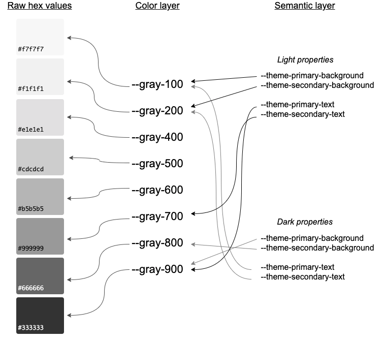
Okay, the design system is now done, right? Nope. There is still more. We haven't talked about the two different themes yet. This is where semantic naming comes back into the picture. Semantic naming will work as the main interface to your palette, creating a level of abstraction on top of your custom properties created above. This is the magic that will make creating two themes a breeze.

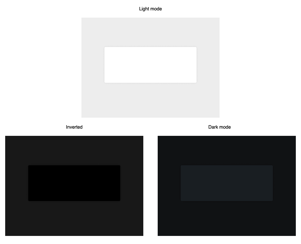
You might ask, why not just invert the color layer and get dark mode for free? The issue with a simple inversion is that different parts of the app do not work well when you simply invert the colors. Here is an example to illustrate something like a card on a plain background.

In light mode, darker colors often communicate distance. In the example, the card feels like it sitting on top of the gray background. This sense of depth makes it easier to understand how this card fits in with the rest of the page. If you were to simply invert the colors, the card would be black and the background would be lighter than the card, causing the page to appear to have a large rectangular hole in it. It will look better if you customize the colors in dark mode to give that same sense of depth.
The semantic layer solves this issue by allowing you to subjectively customize elements on the page between the two themes. The amazing part of using this two-tier scheme is that extending to a third theme or even a custom one will be trivial. It is also much easier to choose the proper color custom property when designing and developing because the names clearly define which one you should use in a particular context.
This is what it will look like all combined.
root: {
  --rgb-red-100: 250, 231, 225;
  --rgb-red-200: 250, 192, 175;
  --rgb-red-300: 250, 160, 161;

  --color-red-100: rgb(var(--rgb-red-100));
  --color-red-200: rgb(var(--rgb-red-200));
  --color-red-400: rgb(var(--rgb-red-400));

  --theme-primary-text: var(--color-red-100);
  --theme-primary-background: var(--color-red-300);
}

[data-theme='dark'] {
  --theme-primary-text: var(--color-red-300);
  --theme-primary-background: var(--color-red-100);
}
This also gives you the flexibility to change the palette between the two themes. At Aha!, we introduced a bit of blue tinting into the gray palette and darkened the shades.

Coming up with semantic names is tough. It is going to require careful analysis of the structure of your app and lots of iteration. That leads us to the next section.
Applying the styles to your app
If your app is massive, it will seem like a daunting task to convert everything over to use these semantic names. It's probably going to take a while. Here is a simple way to break down the work.
Normalize your existing colors
First, go through the app and convert over your old hex values and variables to your new color naming scheme (not the semantic one). This should be relatively easy to do with regular expressions and global search and replace. It can be super handy to have a tool to match any hex values you find with the closest value in your palette.
I downloaded the source on this page and changed the .csv file to target a different list of colors.
Deploying these changes to production regularly will give you time to adjust any color changes you make to elements with colors that were not in your palette.
Convert one page to dark mode
Next, pick a page and take on dark mode. Restrict dark mode so that it only applies when dark mode is enabled and a specific flag is present for that page. Something like this:
.dark-mode-allowed[data-theme"dark"] {
  ...;
}
Here is how you would apply it to your page:
<body class="dark-mode-allowed" data-theme="dark"></body>This will enable you to navigate to other pages without them looking terrible. If you add a feature flag to restrict to some test accounts, you can also deploy to production as you work. Go through everything on that page and convert it to use the semantic naming scheme. This is when you will actually be fleshing out that naming scheme. You can give the custom properties rough names until you use them a few times and figure out a good pattern. Be sure to revisit them often and look for anything you can merge. You don't have to worry about modifying styles shared between pages because the light mode value for those properties should be resolving to the same value as before.
Create a shortcut key sequence for switching between light and dark mode. This is also a great time to add a flashy transition between the two themes:
// Add a stylesheet to the body which makes switching to another mode fade
// between the two. Remove the style when done so it doesn't apply to normal
// changes.
function withCoolTransition(wrappedFunction) {
  const style = document.createElement('style');
  style.type = 'text/css';
  style.innerHTML = '* { transition: background-color 0.3s, border 0.3s; }';
  document.body.append(style);

  wrappedFunction();

  setTimeout(() => {
    document.body.removeChild(style);
  }, 300);
}

withCoolTransition(() => {
  document.body.setAttribute('data-theme', newTheme);
});
Completing dark mode
Repeat the process of converting over every page in your app. There may be a few gotchas along the way. Some things to watch out for include color pickers, user-generated content, and server-side rendering.
Color pickers are often provided to give a user the ability to change the appearance of something in the app. It might be okay to use the same colors for both themes but you might also want to transform those colors between the two themes. If you allow for a limited number of selections, then it's easy to build a mapping for the palette. If you allow choosing from the entire RGB spectrum, then you might have to create a mathematical formula for translating a color between themes. At Aha!, our color picker has a palette to choose from in addition to providing a custom color. We chose to map the palette and leave the custom ones alone.

User-generated content is anything where a user can enter content with colors, such as embedded HTML. It is another one to watch out for. We have a lot of user-generated content in Aha! that can be synced to and from external services via integrations. As such, we cannot use variables to represent those colors. The only way to handle the user-generated content is to parse the content and replace colors before displaying it to the user.
Server-side rendered content can be another source of color information. Because we use Rails at Aha!, we often generate the markup server-side. This includes transformations to some user-selected colors, such as those from the color picker. Helpers have to be tracked down and converted to return the proper color depending on the user's selected theme.
  def self.map_color_from_color_picker_to_dark_mode(color)
    return color unless dark_mode?

    if color[0] == "#"
      color = color[1..-1]
      add_hash = true
    end

    if color.length == 3
      color = color[0] * 2 + color[1] * 2 + color[2] * 2
    end

    new_color = PALETTE_COLORS_LIGHT_THEME_TO_DARK[color.downcase] || color

    add_hash ? "##{new_color}" : new_color
  end
Once you finish the last page, you can take off the training wheels by removing the dark-mode-allowed condition, enable any feature flags you created so everyone has access to the feature, and let your users take dark mode for a spin.
Job well done
Looking back, that might seem like a lot of work. It definitely isn't trivial. However, each step in the process is fairly simple and safe. It just takes time, patience, and maybe a little grit. Before you know it, your app is going to look amazing.
